
Accessibility-First Design and Performance Minimalism in 2025
Two web design trends grew quickly through 2025: accessibility-first design and performance-focused minimalism. We look at what each means, why WebAIM data, the ADA Title II rule and Google's Core Web Vitals are pushing them forward, and why uneven connectivity makes lean, inclusive sites especially important in Southeast Alaska.

At a glance
The short version
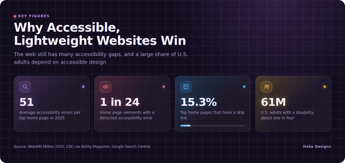
This infographic sums up the article on one page. Save it, share it with your team, or read on for the detail and the sources behind it.
In this article · 5 sections · 7 min
Some web design trends are about looks, like a new color palette or a different style of typography. The two trends we focus on here are about something more basic: whether people can actually use a website. Accessibility-first design and performance-focused minimalism grew quickly through 2025. They also work well together. A site built for everyone tends to be simpler, and a simpler site tends to be faster.
Hoke Designs is a family-owned web design, development and hosting studio in Juneau that has been designing websites since 2007. This article explains how each trend is being used and why both are popular. It also covers why they matter for businesses and organizations in Southeast Alaska.
Trend 1: Accessibility-First Design
What it means
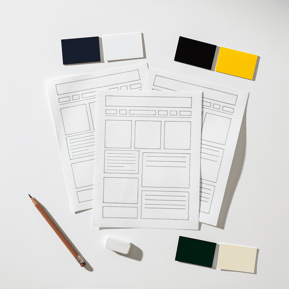
For years, accessibility was often handled at the end of a project. A team built the site, then fixed whatever problems an audit turned up. Accessibility-first design reverses that order. From the first wireframe, designers and developers plan for people who use screen readers, navigate by keyboard, need strong color contrast, or have trouble processing cluttered layouts.
In practice, accessibility-first design usually shows up in a few ways:

- Readable contrast and type. Text and backgrounds are chosen so content stays legible for people with low vision.
- Meaningful structure. Headings, lists and landmarks are marked up properly, so assistive technology can describe the page accurately.
- Keyboard-friendly navigation. Menus, forms and buttons work without a mouse, and focus states are visible.
- Descriptive alternative text for images, so photography carries meaning for people who can’t see it.
- Skip links that let keyboard and screen reader users jump past repeated navigation straight to the main content.
Why it is popular: the gap is still large
One reason this trend gained momentum is that the web still has a long way to go. The WebAIM Million 2025 report, which tests the top one million home pages, found 50,960,288 distinct accessibility errors, an average of 51 errors per page. Put another way, 4.1% of all home page elements had a detected error, so users with disabilities could expect to hit an error on 1 in every 24 elements.
Even simple fixes are often missing. Only 15.3% of home pages had a “skip” link, up slightly from 13.3% in 2024. A skip link is one small line of code, which shows how many easy wins are still available.
There is some good news too. The average number of detected errors per home page dropped from 56.8 in 2024 to 51 in 2025. Progress is real, but it is slow. That is part of why designers are moving accessibility to the start of the process instead of patching it on later.

Why it is popular: the audience is huge
Accessibility is not a niche concern. According to CDC data reported by Ability Magazine, 61 million adults in the United States have a disability, about one in four U.S. adults. The same report notes that mobility disability is the most common type at 13.7 percent, followed by cognition disability at 10.8 percent.
Those two categories say a lot about design. People with mobility disabilities often depend on keyboard navigation or other input devices. People with cognitive disabilities benefit from clear layouts, plain language and predictable navigation. A site that ignores those needs risks shutting out a large share of its potential customers, visitors or constituents.
Why it is popular: the rules are getting clearer
Regulation is another driver, especially for public bodies. On April 24, 2024, the U.S. Department of Justice published a final rule under Title II of the ADA requiring state and local governments to make their websites and mobile apps conform to WCAG 2.1 Level AA. Later, an interim final rule issued in April 2026 pushed each Title II compliance deadline back by one year, while the technical standard stayed the same: WCAG 2.1 Levels A and AA.
For cities, boroughs and other local government bodies across Southeast Alaska, the delay gives more time, but the target has not changed. Many private organizations follow the same standard voluntarily, because it gives everyone a shared, specific benchmark.
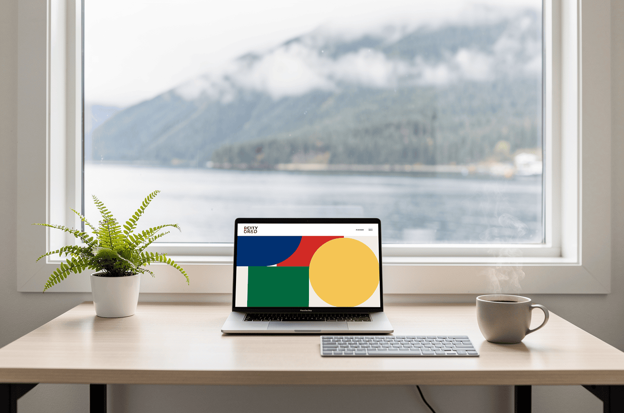
Trend 2: Performance-Focused Minimalism
What it means
Minimalism in web design is nothing new. What changed in 2025 is the reason behind it. Performance-focused minimalism is less about a clean aesthetic and more about cutting anything that slows a page down or makes it harder to use. That usually means:
- Fewer scripts, plugins and third-party widgets
- Images sized and compressed for the screen they are shown on
- Simpler page structures with fewer nested elements
- Layouts that reserve space for images and ads so content doesn’t jump around while loading
- A clear focus on the one or two things each page needs visitors to do
Why it is popular: speed is measurable
Google gave site owners a concrete way to measure performance. Its Core Web Vitals are three metrics: Largest Contentful Paint (LCP) for loading, Interaction to Next Paint (INP) for responsiveness, and Cumulative Layout Shift (CLS) for visual stability, and Google Search Central recommends good Core Web Vitals for success in Search.
The “good” thresholds are specific: LCP of 2.5 seconds or less, INP of 200 milliseconds or less, and CLS of 0.1 or less, measured at the 75th percentile of page visits. That last detail matters. A site can’t just be fast for the people on the best connections. It has to be fast for most visitors, including those on slower networks.
Why it is popular in Alaska: connectivity is uneven
The 75th-percentile standard means a lot here. Alaska’s connectivity has long been limited by the state’s 600,000-square-mile size, sparse population, rugged terrain and weather, and the state has relied on wireless technologies outside urban areas. Governor Mike Dunleavy created the Alaska Office of Broadband to close the digital divide in rural, suburban and tribal communities, because parts of Alaska still lack high-speed internet or any internet at all.
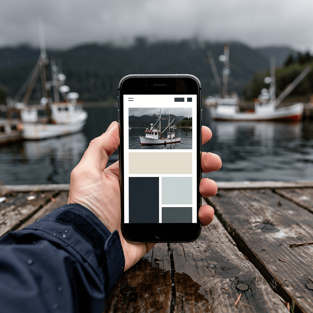
For a business in Juneau, Sitka, Ketchikan or Haines, some visitors may be browsing from a fast home connection. Others may be on a cell signal in a smaller community, or on a boat. A heavy page that loads fine in an office can stall for those visitors. A lean page is simply a more reliable way to reach people across the region.
Where the Two Trends Meet
Accessibility and performance are often treated as separate checklists, but the 2025 data suggests they are closely linked. WebAIM says a main concern is the fast growth in the number of home page elements and in ARIA code, because both are linked to more accessibility problems. More elements and more complex code mean more chances for something to break for screen reader users. They also mean more for a browser to download and render.
That is why the two trends support each other:

- Fewer elements mean fewer places for accessibility errors and less work for the browser.
- Stable layouts (good CLS) help everyone, but they especially help people with motor or cognitive disabilities who can lose their place when content shifts.
- Clear structure helps assistive technology, search engines and hurried visitors alike.
- Responsive interactions (good INP) make forms and menus feel dependable for keyboard and touch users.
Minimal Doesn’t Have to Mean Plain
Some people worry that a lightweight site has to be bland. It doesn’t. Southeast Alaska businesses, especially in tourism, real estate and marine work, rely on strong imagery to show what they offer. Performance-focused minimalism isn’t about removing photography. It’s about presenting fewer, better images at sensible sizes, with descriptive alt text, inside a layout that stays out of the way.
This is also where custom design has an advantage over generic templates. Many templates ship with features a site never uses, and each one adds weight. A site designed around one organization’s actual content can include what it needs and leave the rest out.
The Bottom Line
Accessibility-first design and performance-focused minimalism are winning for practical reasons. A large share of people need accessible sites, accessibility standards are getting clearer, Google measures page experience, and in Alaska, connections vary widely from place to place. Sites that are inclusive and lightweight reach more people and hold up better when conditions aren’t ideal.
If you’d like to talk about your website, call (424) 209-8199 or send us a message through our contact form, and a real person will reply within one business day.
Images are presented for illustration purposes only.We use real photographs when we need to show what was happening at a real event.
Keep reading
More on Web Design
Variable Fonts and Custom Cursors: Small Web Design Trends
Variable fonts and expressive custom cursors are two small details that can make a website feel more polished and more like the brand behind it. We…
Sticky Navigation and Thumb-Zone Design: Where Menus Belong Now
Menus no longer have to sit in one row at the top of the page. We explain how sticky headers and thumb-zone design help visitors find…
Kinetic Typography and Anti-Design: Web Design That Breaks the Rules
Moving headlines and deliberately rough layouts are replacing the clean, template-driven look. Here is what kinetic typography and anti-design brutalism are and how designers use them.…
Hoke Designs
Questions about your own website?
Talk to the team that writes these articles and looks after dozens of sites every day. You’ll get a straight answer.