

Grain, Mesh Gradients and Hand-Drawn Illustration: The Tactile Turn in Web Design
Flat, clinical web design is giving way to sites with texture. We look at grainy textures, mesh gradients and hand-drawn illustration: how designers are using each one, why brands want a more human feel, and how to use these trends without hurting readability or performance.
At a glance
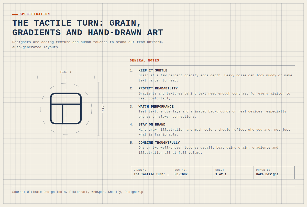
The short version
This infographic sums up the article on one page. Save it, share it with your team, or read on for the detail and the sources behind it.
In this article · 5 sections · 6 min
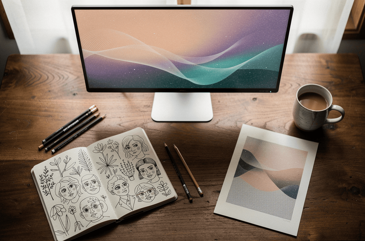
For years, the polished look of web design meant perfectly flat colors, crisp vector shapes and layouts so clean they could feel almost clinical. That look is changing. More websites now have a surface you can almost feel. You see it in soft speckled grain over a background, color that drifts and blends like light through fog, and illustrations that look like someone actually drew them.
We have been designing websites at Hoke Designs since 2007, and we build custom sites rather than templates, so we pay close attention to where visual style is heading. In this article we look at three closely related trends: grainy textures, mesh gradients and hand-drawn illustration. We cover how designers are using each one and why so many brands are reaching for a more tactile, human feel.
Why tactile design is having a moment
Most people building websites today have noticed the same thing. Many sites have started to look alike. Design tools, templates and AI generators make it fast to produce a competent page, but the results tend to blend together. According to WebSpec, texture is returning to websites as a direct reaction to over-automation. As AI speeds up production and makes layouts more uniform, designers are deliberately adding tactile elements again to restore originality and a human touch.
Others are seeing the same shift. Avenue Z, citing Adobe, describes the 2025 design landscape as being about balancing the efficiency of machine-generated work with emotional resonance and visual individuality. Looking ahead, Lovable notes that after years of AI experiments and template fatigue, designers are moving toward deliberate, human-centered approaches that value authenticity over the sameness algorithms produce.
In short, imperfection has become a feature. Each of the three trends below adds a small, intentional trace of the human hand to a medium that can easily feel sterile.

Trend 1: Grainy textures
How it is being used
Grain is a fine, film-like noise layered over images, backgrounds or color fields. It shows up in hero sections, behind headlines, inside cards and over photography. The effect is often subtle enough that visitors don’t consciously notice it. They simply feel that the page has more depth.
The trend has grown out of earlier texture styles. Piktochart’s review of 2025 graphic design trends found that textured effects were still popular but were moving away from 3D and toward grainy textures, and that retro elements remained in style. Skyrye Design notes that designers increasingly use grain effects to give flat digital visuals depth and a tactile feel, and to bring back nostalgia while making modern designs look richer.
Why it is popular
Part of the appeal is emotional, because grain recalls printed paper, film photography and risograph posters. Part of it is practical. Smooth digital gradients can show banding, which is the visible stepping between colors. Ultimate Design Tools explains that adding noise to CSS gradients prevents banding, which shows up most in dark color ranges, and that a 3 to 5% noise overlay on a hero section looks more polished and intentional than a perfectly clean gradient.
There is one caution. The same source notes that a noise overlay on a hero section barely affects performance, but a full-screen overlay on a page with heavy animations can cause jank (stuttering), so designers should test scroll performance with the overlay on and off. Texture should improve the experience, not slow it down.
Trend 2: Mesh gradients
How it is being used
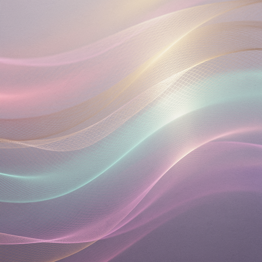
A mesh gradient blends several colors across a surface in organic, flowing shapes rather than in a straight line from one color to another. The result looks less like a paint swatch and more like a sky at dusk or light moving across water. DesignerUp points to well-known examples: mesh gradients like Stripe’s, aurora gradients like Apple’s and blended gradients like Asana’s now appear everywhere in UI design, as backgrounds, on buttons and over text.
Why it is popular
Mesh gradients give a page atmosphere without crowding it. They can set a mood, guide the eye toward a call to action or give a brand a recognizable color signature, all without adding more words or images. They also pair naturally with grain. A light noise layer over a mesh gradient smooths the color transitions and gives the surface a soft, almost printed quality, which links this trend back to the tactile look described above.
For businesses in Southeast Alaska, this style has an obvious source of inspiration close to home. Soft, shifting color fields can echo northern skies, glacial blues or a rainforest palette when they suit a brand, without depending on a stock photo to set the tone.
Trend 3: Hand-drawn illustration
How it is being used
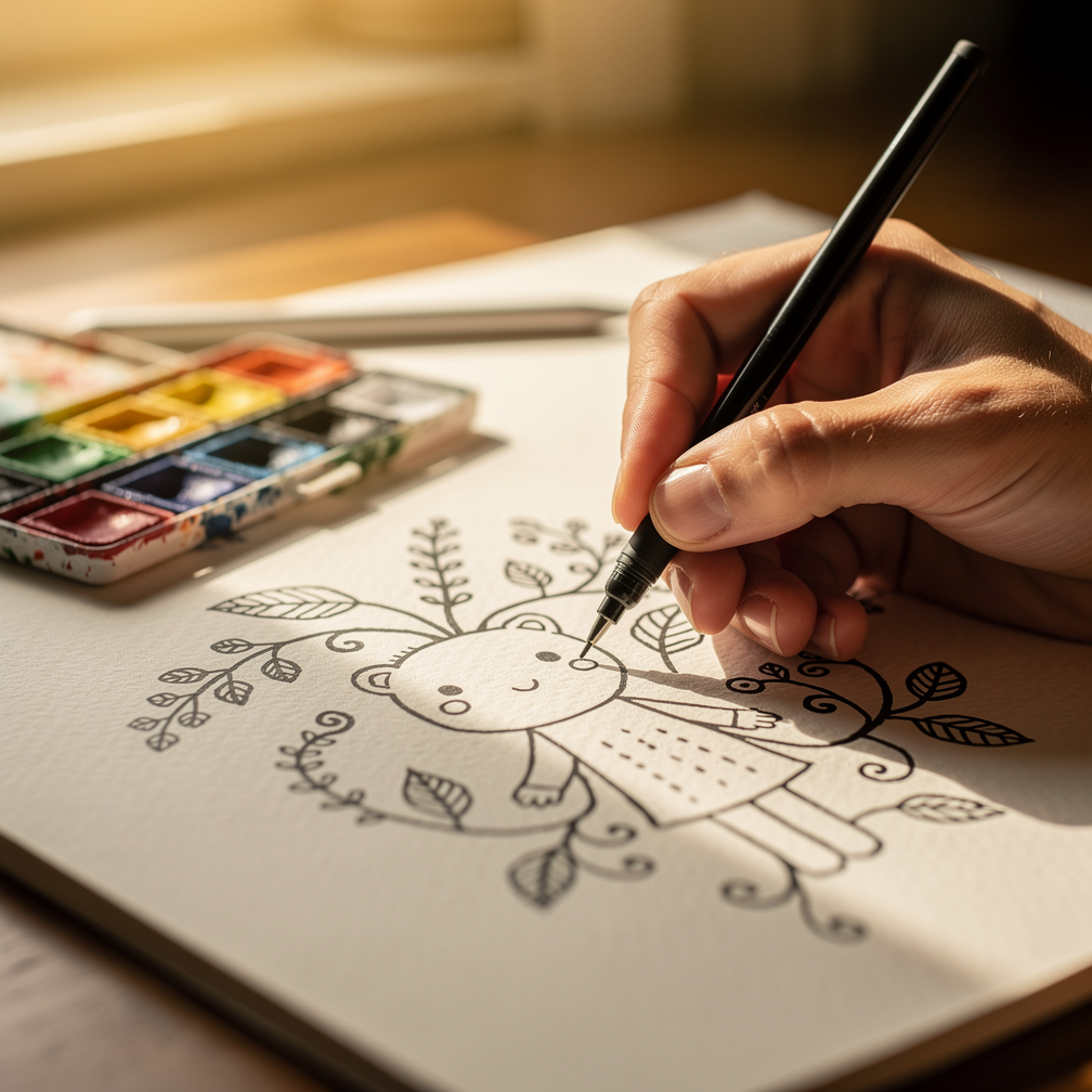
Hand-drawn elements range from full illustrated scenes to small touches such as a scribbled underline, a doodled arrow pointing to a button, sketchy icons or handwritten-style lettering. Geniusee reports that web designers are using hand-drawn elements more and more, because imperfect, cartoon-like illustrations feel more relatable and appealing.
Typography is following the same path. Shopify listed “Chicken Scratch” typography among its top design trends for 2025, and Gordon College’s student paper, The Tartan, reports this as a sign that the wider culture is getting tired of “perfect” AI-generated designs.
Why it is popular
Hand-drawn work signals that a person was involved. A slightly wobbly line or an uneven letter tells visitors that someone made a choice, which is exactly the quality that uniform, auto-generated layouts lack. Illustration can also explain a service, show personality or add humor in ways a photo cannot. That makes it especially useful for brands that want to come across as approachable rather than corporate.
Using these trends well
None of these trends works as a coat of paint applied for its own sake. A few principles help keep them effective:
- Keep it subtle. Grain at a few percent opacity adds depth. Heavy noise can look muddy or make text harder to read.
- Protect readability. Gradients and textures behind text need enough contrast for every visitor to read comfortably.
- Watch performance. Test texture overlays and animated backgrounds on real devices, especially phones on slower connections.
- Stay on brand. Hand-drawn illustration and mesh colors should reflect who you are, not just what is fashionable this year.
- Combine thoughtfully. These trends work well together, but one or two well-chosen touches usually beat using all three at full volume.
The common thread is intent. Grain, mesh gradients and hand-drawn illustration are popular because they make a website feel considered, specific and human at a time when much of the web is starting to look the same. Used with care, they help a site feel like it belongs to one particular business and not to everyone.
If you would like a custom site with a little more texture and personality, call (424) 209-8199 or send a message through our contact form, and a person will reply within one business day.
Images are presented for illustration purposes only.We use real photographs when we need to show what was happening at a real event.
Keep reading
More on Web Design
Booking, Event Hubs and Fast Mobile Pages: Web Design Trends for Southeast Alaska
With Juneau welcoming a record 1.68 million cruise passengers in 2024 and a daily cap arriving in 2026, websites need to do more than list a…
Variable Fonts and Custom Cursors: Small Web Design Trends
Variable fonts and expressive custom cursors are two small details that can make a website feel more polished and more like the brand behind it. We…
Sticky Navigation and Thumb-Zone Design: Where Menus Belong Now
Menus no longer have to sit in one row at the top of the page. We explain how sticky headers and thumb-zone design help visitors find…
Hoke Designs
Questions about your own website?
Talk to the team that writes these articles and looks after dozens of sites every day. You’ll get a straight answer.