

Split-Screen Layouts and Bold Color Blocking in Web Design
Many modern homepages now cut the screen in half or into blocks of saturated color. We look at what split-screen layouts and color blocking are, how designers use them, why they work and where they go wrong, especially on mobile.
At a glance
The short version
This infographic sums up the article on one page. Save it, share it with your team, or read on for the detail and the sources behind it.
In this article · 5 sections · 7 min
Open a handful of modern websites and you will likely notice a pattern. Instead of one long, centered column of text and images, many homepages now cut the screen in half, or into blocks of strong, saturated color. The page is divided on purpose, and that division is the statement.
At Hoke Designs, we have been designing websites since 2007, long enough to watch many trends arrive, peak and fade. Two that have proven unusually durable are split-screen layouts and bold color blocking. In this article, we look at what each trend is, how designers are using it, why it resonates with visitors and where it can go wrong.
Trend One: The Split-Screen Layout
What It Is
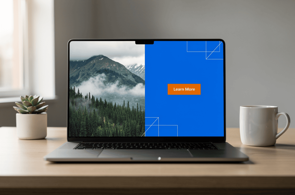
A split-screen layout divides full-screen elements into two or more vertical parts. Picture a homepage where the left half shows a striking photograph and the right half holds a headline, a short message and a button. Each side carries its own content, yet the two halves read as a single composition.
This is not a brand-new idea. Split-screen designs became popular around mid-2016, and they have kept their place. Vertical split-screen layouts were even called one of the biggest UI/UX design trends of 2023. For a web trend, that kind of staying power is notable.
How It Is Being Used
The most practical use of a split screen is to present a choice. A split-screen homepage divides the page into two equal areas with different information in each, and it works best for ecommerce homepages, such as separating different types of clothing, or for software companies that offer two product types.
The same logic applies well beyond fashion and software. Consider how a split might serve different kinds of businesses in Southeast Alaska:
- A tour or marine operator could split the homepage between a summer offering and a winter offering, letting each visitor go straight to the season they care about.
- A real estate site might separate “Buying” from “Selling,” two audiences with very different questions.
- A construction or land survey firm could pair a dramatic aerial image on one side with a clear summary of services on the other.
- A research or wildlife organization might divide the page between visitors who want to learn and supporters who want to get involved.
Even when there is no choice to make, a split can pair a strong visual with a strong message, so neither has to compete for the same space.
Why It Is Popular
Split screens are popular largely because first impressions happen remarkably fast. Research by Lindgaard and colleagues found that people can judge a web page’s visual appeal within 50 milliseconds, which means designers have roughly that long to make a good impression. A split screen communicates its structure almost instantly: two sides, two ideas, one obvious next step.
There is also a balance element. A well-composed split feels deliberate and calm. Image and text each get room to breathe, which can make a homepage feel more confident than one crowded with competing elements.
Trend Two: Bold Color Blocking
What It Is
Color blocking uses large, solid areas of strong color to organize a page. Rather than relying on subtle gradients or a neutral background with small accents, the design leans on big, confident panels of color, with each block often signaling a different section or purpose.
How It Is Being Used
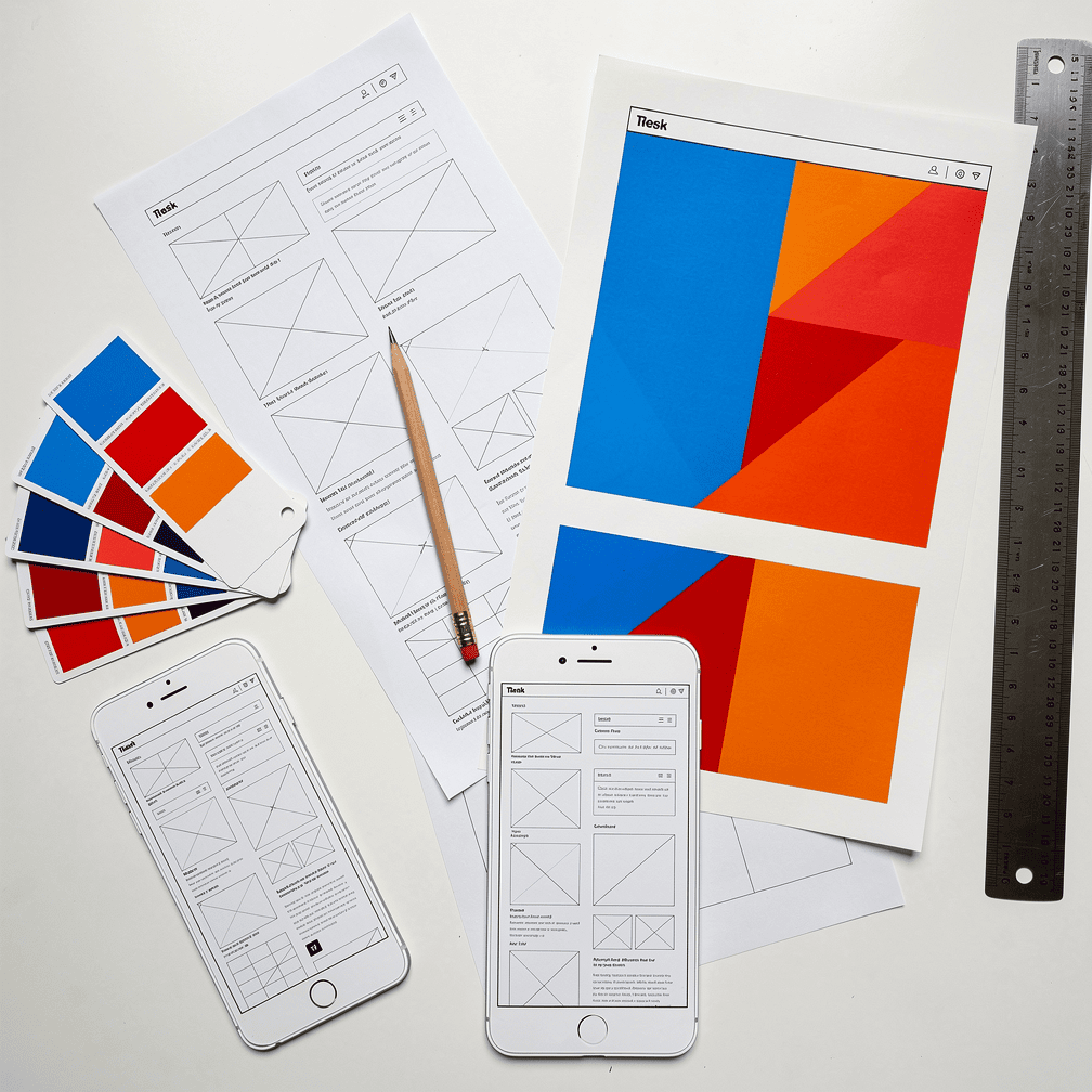
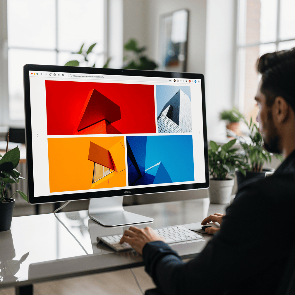
Coverage of small-business design trends for 2025 notes that maximalism and brutalism are on the rise, with brands using vibrant color blocking. The same source recommends splitting a site into bold color panels to make navigation intuitive. In other words, color is not only decoration. It acts as a map that tells visitors where one area ends and the next begins.
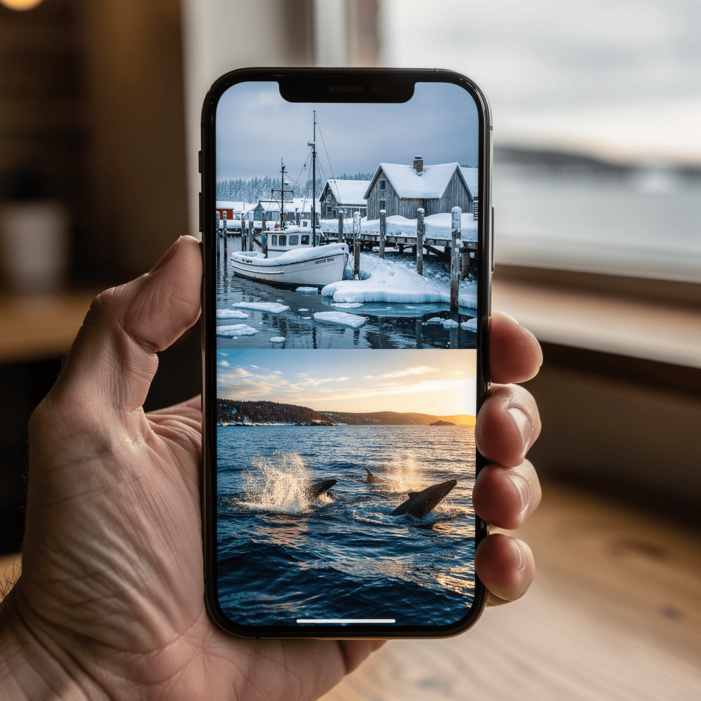
The palette has been loud, too. Bold colors such as electric blue, fiery red and vivid orange dominated 2025 web designs, and these hues are meant to suggest energy, urgency and enthusiasm.
Why It Is Popular
Color blocking stands out in a sea of similar-looking sites. It gives brands a recognizable visual signature, and it organizes content without adding clutter. A visitor does not need to read a menu to understand that the deep-blue section is about one thing and the orange section is about another.
Color also carries emotion. An energetic red or orange says something very different from a muted gray, and brands increasingly use that contrast to set the tone before a visitor reads a single word.
Better Together: When Split Screens Meet Color Blocks
These two trends naturally reinforce each other. A split screen creates the structure, and color blocking gives each side its identity. Imagine a homepage where one half is a rich ocean blue and the other a warm, glowing orange, each with its own headline and button. The visitor immediately understands there are two paths, and the colors make each path memorable.
For businesses with strong photography, the combination can be especially effective: a full-bleed photo on one side, a solid brand color with clean text on the other. In a region as visually dramatic as Southeast Alaska, pairing landscape or aerial imagery with a confident color panel is a natural fit.
The Caveats: Where These Trends Can Go Wrong
Mobile Changes Everything
A side-by-side layout looks great on a wide monitor, but most people are not browsing on one. As of July 2025, mobile devices accounted for 60.5% of global web traffic, compared with 39.5% for desktop. A split screen squeezed onto a phone can become cramped and hard to read.
The standard solution is responsive design. Responsive websites adapt split screens by stacking the panels vertically on smaller screens, using CSS grid and flexbox so the layout stays easy to use on every screen size. Done well, the two halves become two clear sections that a phone user simply scrolls through.
Less Room for Content
Splitting the screen is not always an advantage. Nielsen Norman Group’s tablet usability report lists split-screen designs among common mistakes and warns that splitting off part of the screen leaves less room for content. If a page needs to carry a lot of information, dividing it can make each half feel crowded.
Bold Can Become Busy
Color blocking has its own risk. Google research found that visual complexity and prototypicality, meaning how typical a site looks for its category, both strongly affect how attractive users find a website, and that this judgment forms within 17 to 50 milliseconds. Too many competing colors increase complexity, and a design that strays too far from what visitors expect in your industry can feel unfamiliar. Bold works best when it is disciplined: a few strong colors, used consistently, with plenty of contrast for readable text.
Is This Approach Right for Your Website?
Split screens and color blocking tend to work well when:
- Your business serves two distinct audiences or offers two main products or services.
- You have strong imagery that deserves room to shine.
- Your brand colors are confident and you want them front and center.
- Your homepage needs to guide visitors quickly rather than explain everything at once.
They may be less suitable when your homepage must hold a lot of detailed information, or when your audience expects a quieter, more traditional look.
Because we build custom-designed sites rather than templates, our view is that trends should serve the business, not the other way around. A split screen or a bold color palette is a tool, and the right choice depends on your audience, your content and how people actually reach your site, especially on their phones.
If you are wondering whether a bolder, divided layout could give your website a stronger first impression, call us at (424) 209-8199 or send a message through our contact form, and a person will reply within one business day.
Images are presented for illustration purposes only.We use real photographs when we need to show what was happening at a real event.
Keep reading
More on Web Design

Scrollytelling Landing Pages and Horizontal Scroll Galleries: How These Web Design Trends Work
Scrollytelling turns a scroll into a guided story, and horizontal galleries let visitors swipe sideways through images and products. We look at how each trend works,…

Grain, Mesh Gradients and Hand-Drawn Illustration: The Tactile Turn in Web Design
Flat, clinical web design is giving way to sites with texture. We look at grainy textures, mesh gradients and hand-drawn illustration: how designers are using each…
Booking, Event Hubs and Fast Mobile Pages: Web Design Trends for Southeast Alaska
With Juneau welcoming a record 1.68 million cruise passengers in 2024 and a daily cap arriving in 2026, websites need to do more than list a…
Hoke Designs
Questions about your own website?
Talk to the team that writes these articles and looks after dozens of sites every day. You’ll get a straight answer.