

Scrollytelling Landing Pages and Horizontal Scroll Galleries: How These Web Design Trends Work
Scrollytelling turns a scroll into a guided story, and horizontal galleries let visitors swipe sideways through images and products. We look at how each trend works, what the research and usability experts say, and how Southeast Alaska businesses can use both without slowing pages down or hiding content.


At a glance
The short version
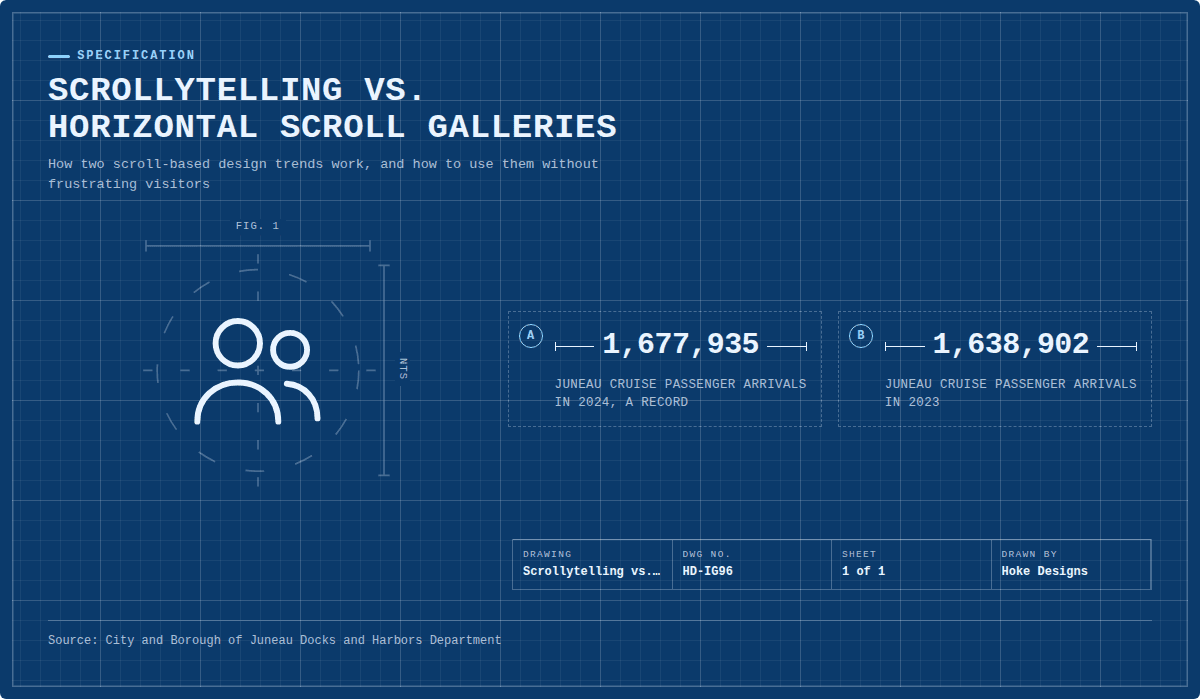
This infographic sums up the article on one page. Save it, share it with your team, or read on for the detail and the sources behind it.
In this article · 3 sections · 7 min
For most of the web’s history, moving through a page meant one thing: scroll down until you find what you need. That habit is still with us, but many designers now treat the scroll as a creative tool rather than a plain navigation mechanic. Two trends lead this shift. Scrollytelling landing pages turn a scroll into a guided story, and horizontal scroll galleries let visitors swipe sideways through images, products or project highlights.
At Hoke Designs, we have designed websites in Juneau since 2007, and we see the scroll as one of the most important parts of how a visitor experiences a site. Below, we look at how each trend works, why it has caught on, and what to keep in mind before adding either one to your own site.
Trend 1: Scrollytelling Landing Pages
What scrollytelling is
Scrollytelling combines scrolling and storytelling. Instead of showing a page as a static stack of text and images, the page reacts as the visitor moves through it. A photo might fade into a map, a headline might pin in place while supporting points slide in beside it, or a short video might play as a section comes into view. Each scroll moves the story forward one step at a time.
The technique is clearly having a moment. Showit includes scrollytelling in its list of top web design trends for 2025, describing sites that go beyond simple up-and-down scrolling. Vistaprint also names scrollytelling among its seven web design trends for 2025.
Why it has become popular
The main appeal is attention. Vistaprint points out that visitors who “power scroll” through a site can miss important information and leave. Scrollytelling slows that down. By revealing content in sequence, it encourages people to take in each point before moving to the next, instead of flicking past everything in a few seconds.
There is also research behind the trend, not just design fashion. A peer-reviewed study of long-form journalism formats found a significant difference in perceived reader engagement in favor of the scrollytelling format. Another ACM study tested scrollytelling on something most people never read closely: privacy policies. Compared with plain text, the scrollytelling version gave a better user experience, with higher engagement, lower cognitive load, more willingness to adopt the format and greater perceived clarity. If the format can make a privacy policy easier to follow, it can certainly help explain a service, a property or a project.
Building these pages has also become more practical. Shorthand, a scrollytelling platform, says its research on interactivity found that faster, easier creation of scrollytelling stories did not come at the cost of reader engagement. In other words, a story doesn’t need to be a huge, expensive production to work.
How scrollytelling fits Southeast Alaska businesses
Scrollytelling works best when there is a real story with a natural order to it, and many organizations in our region have exactly that.
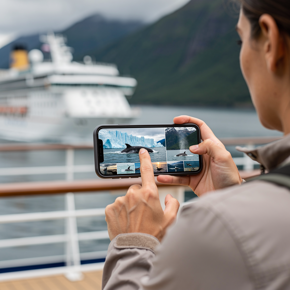
- Tourism and marine operators. Visitor numbers make a strong case for a memorable landing page. Juneau recorded 1,677,935 cruise passenger arrivals in 2024, up from 1,638,902 in 2023, a record for the second year in a row according to the City and Borough of Juneau’s Docks and Harbors Department. A CLIA port profile reports that peak cruise activity in 2024 came in July, with large vessels carrying the largest share of passengers. And Juneau has since set a cruise passenger record for the fourth year in a row in 2026, even with voluntary daily limits in place for the first time. With that many visitors comparing options on their phones, a tour page that walks them from the dock to the glacier, one scroll at a time, can make a real difference.
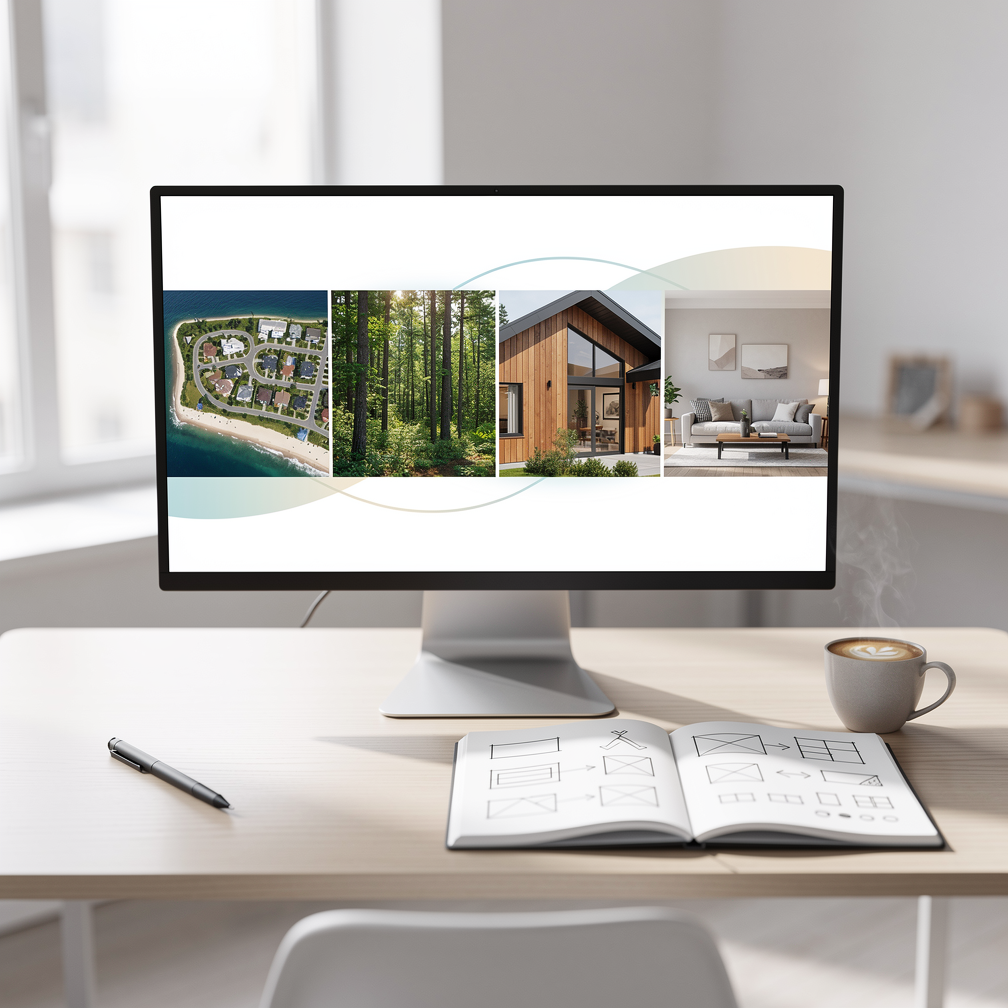
- Real estate. A property page can move from an aerial view of the neighborhood to the lot, the exterior and then the rooms inside, the way a buyer would experience a visit.
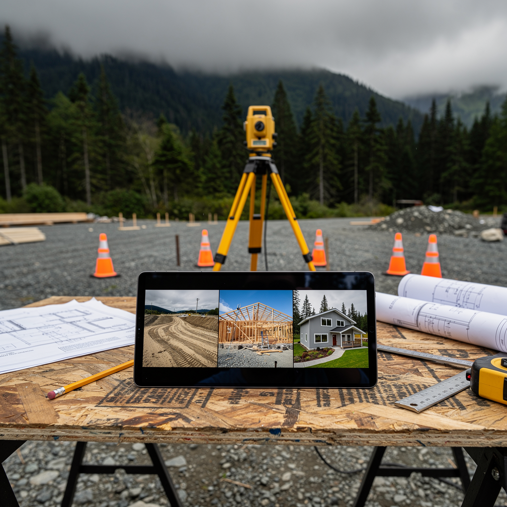
- Construction and land survey. A project story can show a site before, during and after work, with each scroll marking a new stage.
- Research and wildlife. Data, maps and field imagery can be revealed in sequence so a general audience can follow findings without feeling buried in charts.
Strong visuals carry this kind of page. Because design, development, photography and FAA-certified drone work all sit under one team at Hoke Designs, the imagery and the page structure can be planned together rather than stitched together after the fact.
Getting scrollytelling right
The format has pitfalls. Heavy animation can slow a page down, especially on mobile connections. Effects that hijack the scroll speed can feel disorienting. And some visitors are sensitive to motion, so it is good practice to respect device settings that request reduced motion. A few guidelines help:
- Use scrollytelling for the story, not for every page. Contact details, prices and booking forms should stay simple and fast.
- Make sure the key message still comes through if animations fail or are turned off.
- Keep each step short. One idea per scroll is a good rule.
- End with a clear next step, such as booking, calling or requesting a quote.
Trend 2: Horizontal Scroll Galleries
How they are being used
Horizontal scroll galleries arrange content in a row that visitors swipe or scroll sideways. You’ve likely used them on streaming services, shopping sites and social apps. On business websites, they commonly show portfolio pieces, product collections, tour options, team members, testimonials or a run of photographs.
Their popularity comes largely from mobile habits. Swiping sideways feels natural on a phone, and a horizontal row lets a page show many items without becoming extremely long. It also creates visual variety: after several vertical sections, a sideways strip of images breaks up the rhythm and invites exploration.
Why caution is still needed
Horizontal scrolling has a complicated reputation among usability experts. Nielsen Norman Group advises designers to avoid horizontal scrolling on web pages and keep it to a minimum elsewhere, and Jakob Nielsen once listed it among the top-ten web design mistakes of 2002. The same guidance notes that when people see a scrollbar, they assume there is more content and get frustrated if they can’t scroll to it.
The key difference today is scope. The problem is a whole page that scrolls sideways, or content that overflows sideways by accident. A deliberate, clearly signaled gallery inside a normal vertical page is a different thing, provided it is built with care.
Making horizontal galleries work
- Show that there’s more. Let the next card peek in from the edge, or add visible arrows, so visitors know to swipe.
- Support every input. Swipe on touch screens, but also arrows or buttons for mouse users and keyboard navigation for people who don’t use a mouse at all.
- Don’t hide essentials. Anything visitors must see, like prices, hours or safety information, belongs in the main vertical flow, not in the fifth card of a carousel.
- Keep it contained. One gallery per section, never a page that forces sideways movement from top to bottom.
- Optimize images. Large photo rows can be heavy, so compressing and lazy-loading images keeps pages fast.
Using Both Together
These two trends often work well side by side. A scrollytelling landing page can lead a visitor through the big story, while a horizontal gallery within one section offers a quick look at options: tour packages, available properties or finished projects. The vertical scroll provides direction, and the horizontal strip provides choice.
The shared lesson is that motion should serve the visitor. Scrollytelling earns its place when it makes information clearer and more memorable. Horizontal galleries earn theirs when they make browsing easier rather than hiding content. Because our sites are custom-designed rather than built from templates, these features can be used where they help and left out where they don’t.
If you’re curious whether a scrollytelling page or horizontal gallery suits your business, call (424) 209-8199 or send us a message through our contact form, and a person will reply within one business day.
Images are presented for illustration purposes only.We use real photographs when we need to show what was happening at a real event.
Keep reading
More on Web Design

Grain, Mesh Gradients and Hand-Drawn Illustration: The Tactile Turn in Web Design
Flat, clinical web design is giving way to sites with texture. We look at grainy textures, mesh gradients and hand-drawn illustration: how designers are using each…
Booking, Event Hubs and Fast Mobile Pages: Web Design Trends for Southeast Alaska
With Juneau welcoming a record 1.68 million cruise passengers in 2024 and a daily cap arriving in 2026, websites need to do more than list a…
Variable Fonts and Custom Cursors: Small Web Design Trends
Variable fonts and expressive custom cursors are two small details that can make a website feel more polished and more like the brand behind it. We…
Hoke Designs
Questions about your own website?
Talk to the team that writes these articles and looks after dozens of sites every day. You’ll get a straight answer.