Dark Mode, Glassmorphism and Organic Shapes in Web Design
Three styles show up across modern websites and apps: dark mode, frosted-glass panels and soft organic shapes. We look at how designers use each one and why it caught on. We also cover what to watch for, from Purdue's battery findings and Apple's Liquid Glass to keeping blobs from cluttering a page.
At a glance
The short version
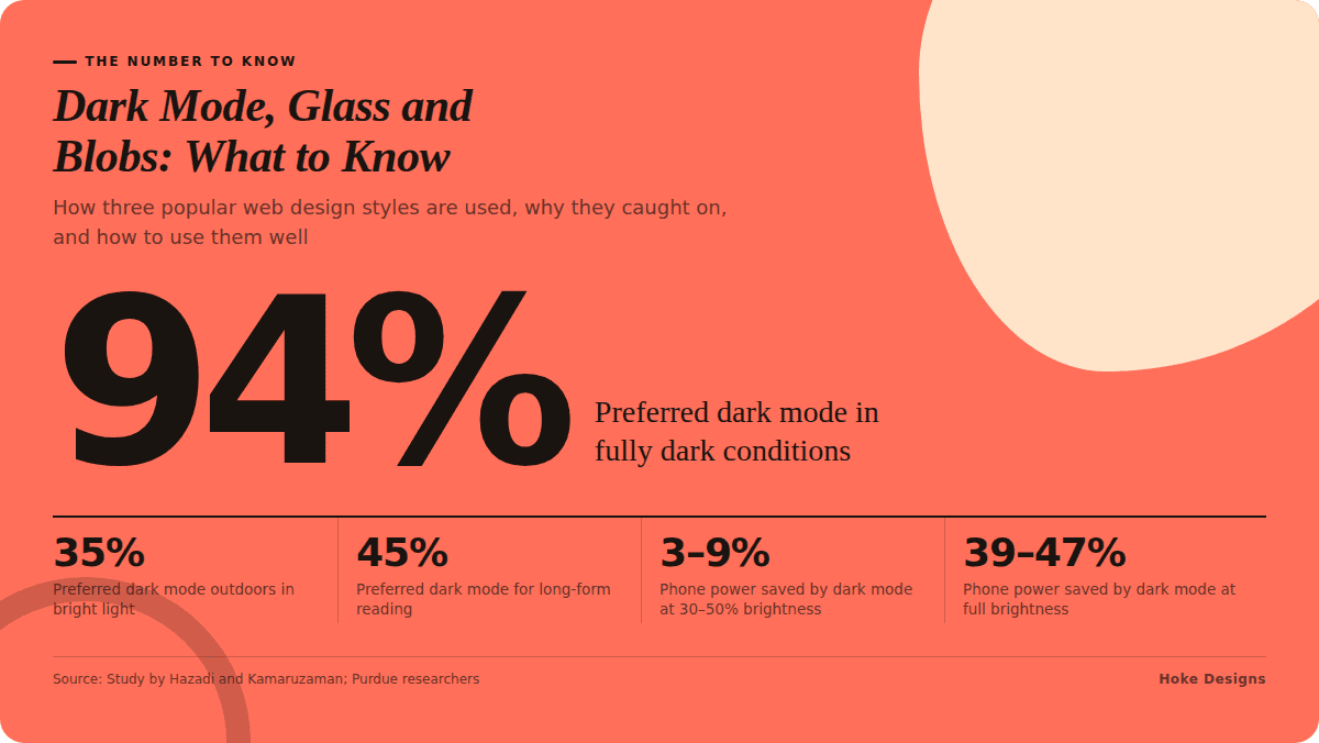
This infographic sums up the article on one page. Save it, share it with your team, or read on for the detail and the sources behind it.
In this article · 4 sections · 7 min
Visit enough websites and apps and you will notice a few looks that keep coming back. You see screens that switch to near-black after sunset, panels that look like frosted glass floating over a colorful background, and soft, rounded blobs where you might once have seen hard rectangles. These three styles shape much of what modern web design looks and feels like.
At Hoke Designs, we have designed websites from our family-owned studio in Juneau since 2007, and we have seen many trends come and go. Below we look at dark mode, glassmorphism and organic shapes. For each one, we cover how designers are using it, why it has caught on, and what to watch for if you want it on your own site.
Dark Mode: A Preference More Than a Requirement
How it is being used
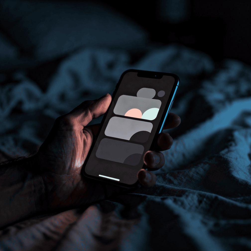
Dark mode flips the usual color scheme. Light text sits on a dark background instead of dark text on white. Most operating systems and many major apps offer it now, and websites increasingly follow the visitor’s device setting automatically. A well-built dark theme is more than an inverted color palette. Designers adjust brand colors, image treatments, shadows and borders so the page still reads clearly and still looks like the same brand.
Why it is popular
Much of dark mode’s appeal comes down to comfort in the right setting. Research suggests the setting matters a great deal. In a study by Hazadi and Kamaruzaman, 94% of respondents preferred dark mode in fully dark conditions, but only 35% preferred it outdoors in bright light, and just 45% preferred it for long-form reading. That pattern makes intuitive sense to anyone who has checked a phone late at night. It also makes sense to anyone browsing during a Southeast Alaska winter, when daylight hours are short.
Many people also assume dark mode saves battery. The reality is more modest. Purdue researchers found that on OLED phones, dark mode reduced total phone power use by only 3–9% at 30–50% screen brightness, though savings rose to 39–47% at full brightness. A Purdue study concluded that dark mode is unlikely to make a big difference to battery life for the way most people use their phones day to day. Dark mode’s popularity, then, has more to do with taste and comfort than efficiency.
Using it well
Nielsen Norman Group offers a useful reality check. It describes dark mode as popular but not essential: users like it but behave about the same without it, and they think of it as a system-wide setting rather than something they toggle site by site. NN/g also advises that sites supporting dark mode should test their designs for common dark-mode problems. For a business website, the practical takeaway is simple. If you offer dark mode, respect the visitor’s device setting and test it carefully. Look for logos that vanish against dark backgrounds, low-contrast text and photos that suddenly look harsh. A dark theme that is only half finished is worse than none.
Glassmorphism: The Frosted-Glass Look Goes Mainstream
How it is being used
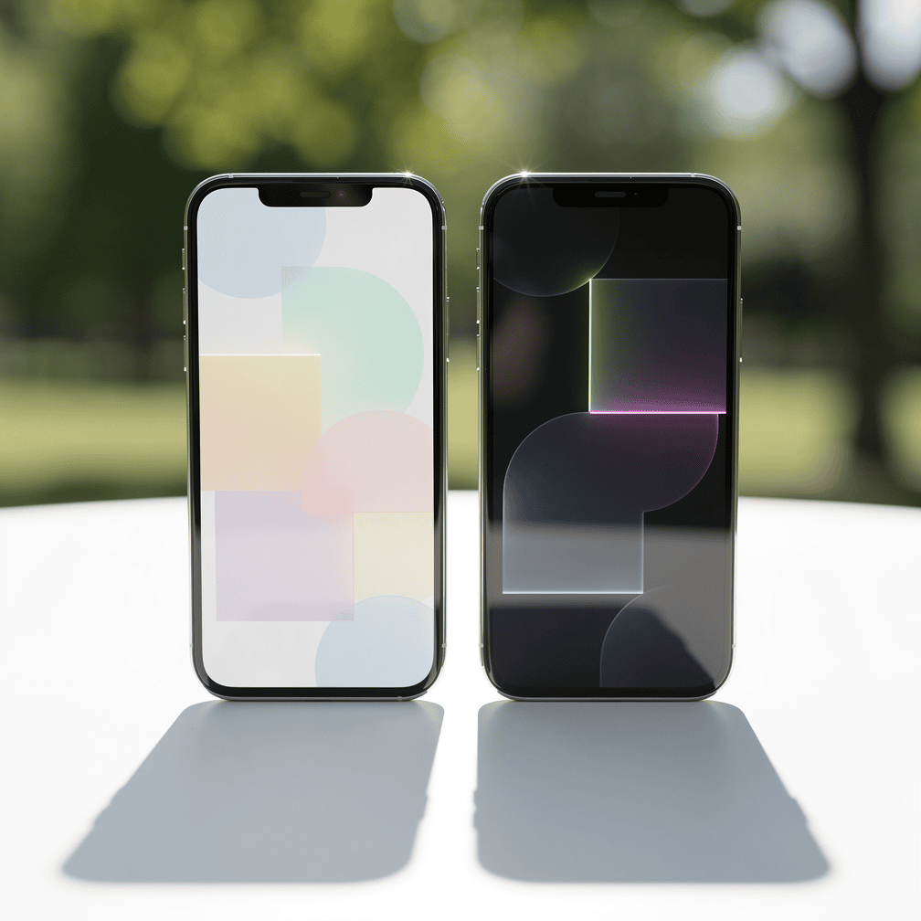
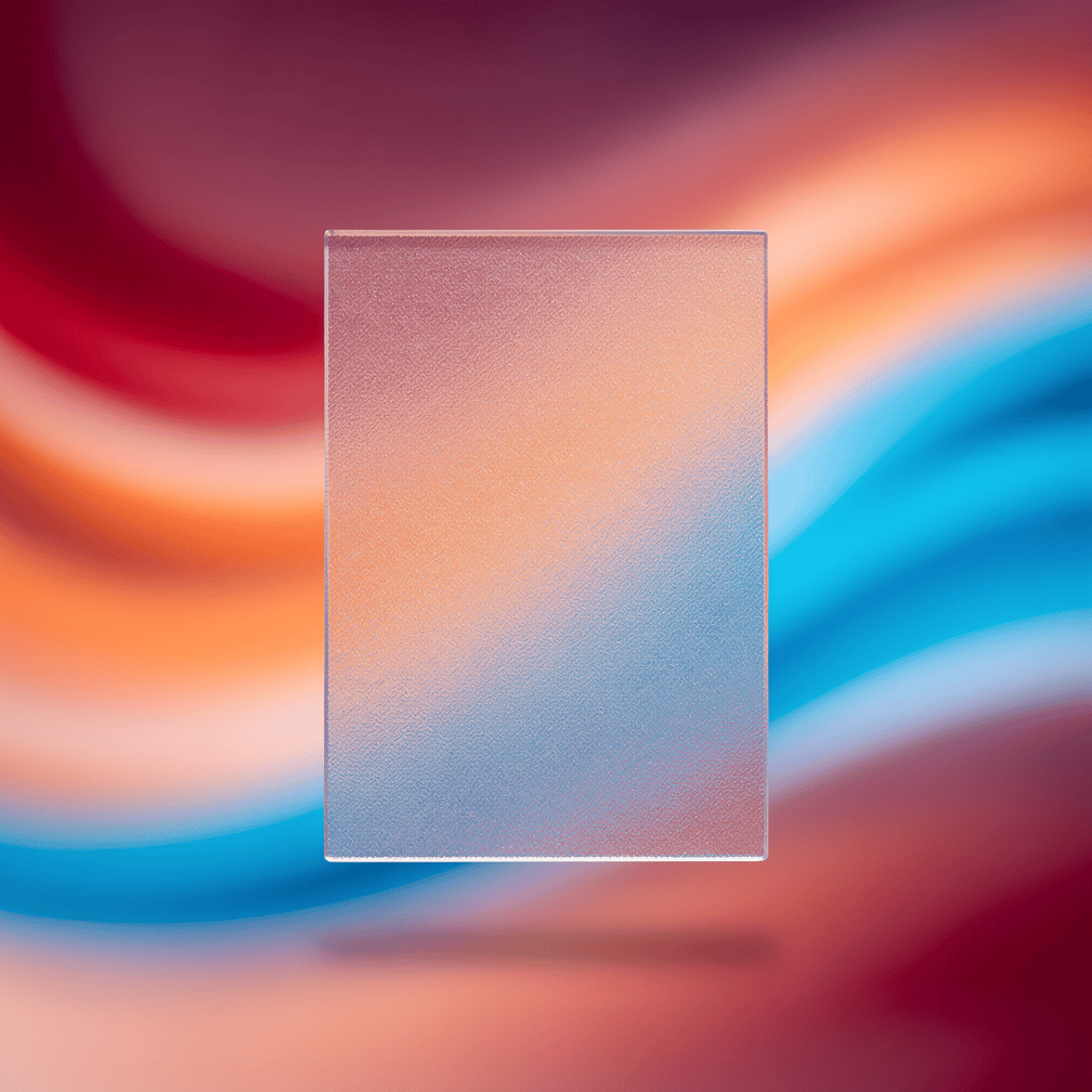
Glassmorphism is a style that imitates frosted or see-through glass. It combines a few ingredients. Backgrounds are semi-transparent. A blur is applied, usually with the CSS backdrop-filter property. Shadows and borders are kept light. Bright gradients sit behind the glass so the blur has something colorful to soften. The result is a layered look, with navigation bars, cards and pop-up panels that seem to float above the content behind them.
Why it is popular
Glassmorphism got a major boost in 2025. At WWDC on June 9, 2025, Apple announced Liquid Glass, a design language that replaced flat design across iOS, iPadOS, macOS, tvOS, visionOS and watchOS. Apple describes Liquid Glass as a translucent material that reflects and refracts its surroundings and changes shape to keep the focus on content, and it uses the material in controls, navigation, app icons and widgets. When one of the world’s most influential design companies puts translucent glass at the center of its interfaces, millions of people get used to that look. Websites soon follow.
Beyond the Apple effect, the style is appealing for practical reasons too. It adds depth without heavy decoration. It lets a striking background image show through, which suits sites built around strong photography. It can also make a page feel modern and polished at a glance.
Using it well
Glassmorphism is easy to overdo. Practical guidance on the style recommends keeping enough color contrast between text and see-through backgrounds, and limiting the effect to elements like cards, modals or navigation. The same source notes that backdrop-filter is GPU-intensive and not fully supported in every browser, so designers should provide solid-color fallbacks. In plain terms, glass works best as an accent, not as wallpaper for the whole site. If your text sits on top of a busy photo, readability has to come first.
Organic Shapes: Softening the Grid
How it is being used
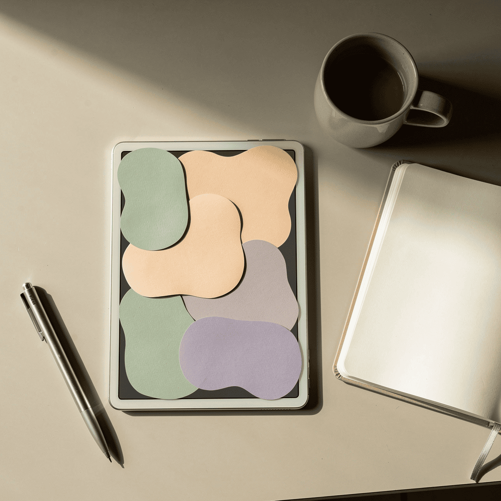
Organic shapes, often called “blobs,” are smooth, irregular forms that look hand-drawn or natural rather than geometric. They show up as background accents behind headlines and as frames for photos or product images. They can also serve as section dividers that curve instead of cutting straight across the page, or as soft color fields that guide the eye. Because they are usually created as SVG graphics, they stay crisp at any screen size and add very little weight to a page.
Why it is popular
Blobs are not a passing fad. They have been a web design trend for years. Designer Ian Latchmansingh even wrote an article titled “2017: The Year of the Blob” about how common organic shapes had become, and free tools like Blobmaker were built specifically to generate SVG blob shapes. Their staying power comes from what they offer. They soften layouts that might otherwise feel rigid, and they bring a friendly, approachable personality. They also break up the boxy look of standard grids.
Organic shapes can also echo a brand’s surroundings. For businesses rooted in a natural landscape, curves can feel more fitting than sharp corners. Think of tourism operators, marine businesses and wildlife research groups across Southeast Alaska.
Using it well
The main risk with blobs is clutter. One or two well-placed shapes add character, while a dozen competing ones make a page feel chaotic. Keep shapes behind or around content rather than on top of it. Tie their colors to your brand palette, and make sure they still look intentional on a narrow phone screen.
Bringing the Styles Together
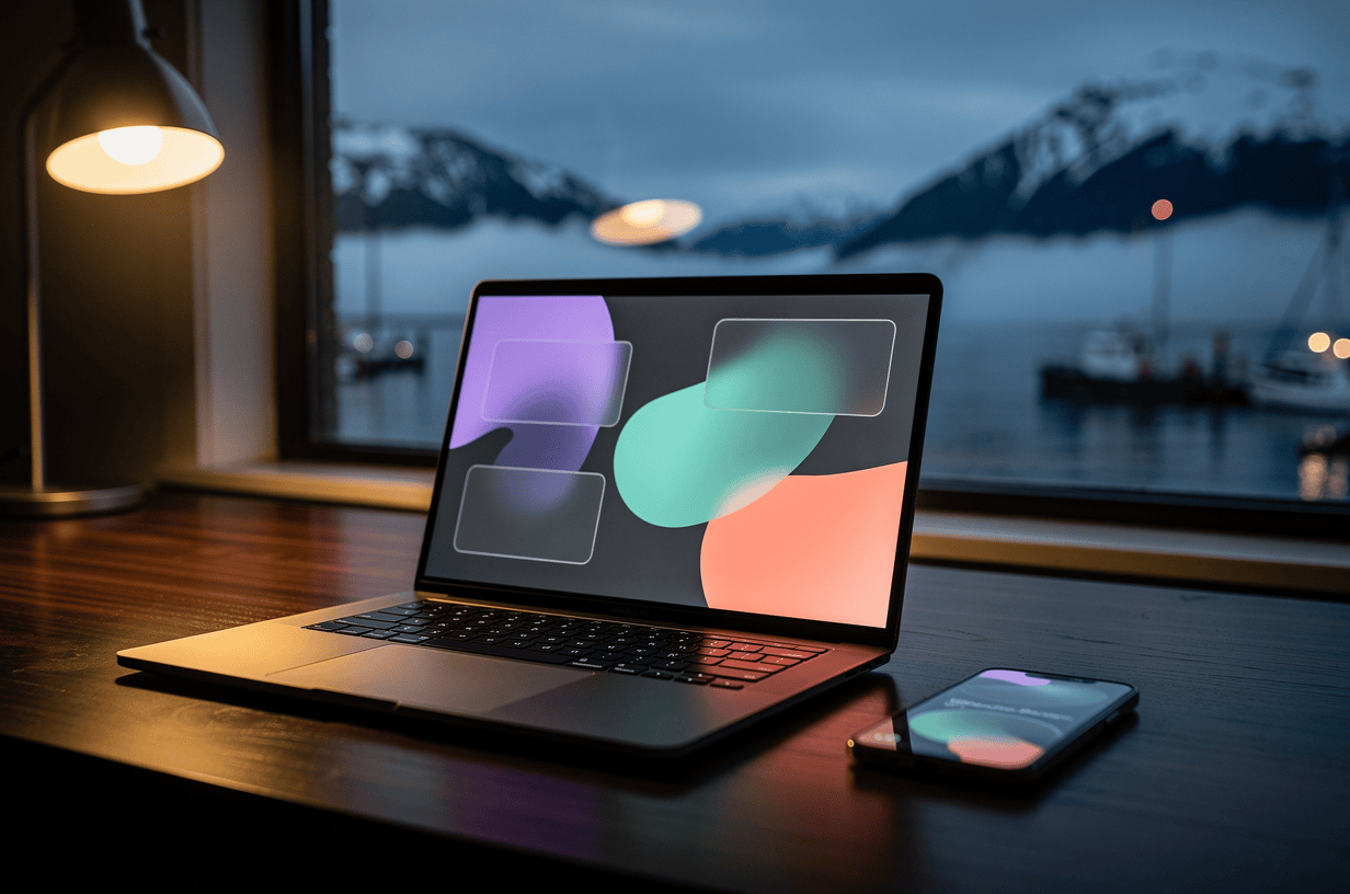
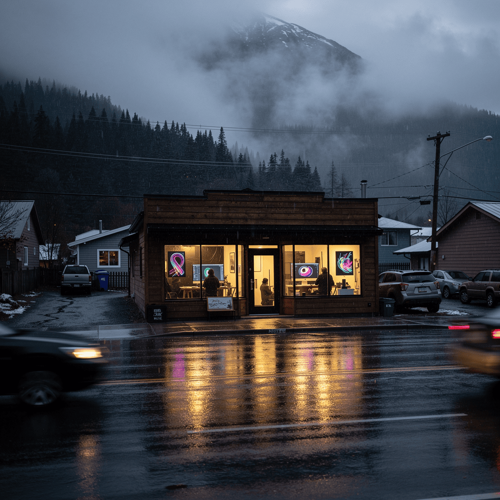
These three trends often work well side by side. A dark theme can make a frosted-glass navigation bar glow. Glass panels can sit on top of soft gradient blobs, giving the blur something colorful to diffuse. They share a common thread too. Each tries to make digital screens feel more comfortable, more layered and a little less mechanical.
Still, a trend is only worth adopting if it serves your visitors. A real estate listing site, a tour booking page and a survey company’s portfolio each have different goals. A style that suits one may get in the way on another. That is why we build custom-designed sites rather than relying on templates. Visual choices like these should be matched to your content, your audience and the devices people actually use to find you.
If you are curious whether dark mode, glassmorphism or organic shapes would suit your website, call (424) 209-8199 or send us a message through our contact form, and a person will reply within one business day.
Images are presented for illustration purposes only.We use real photographs when we need to show what was happening at a real event.
Keep reading
More on Web Design
Web Motion Trends: Scroll-Driven Animation, Micro-Interactions and Reduced Motion
Motion now shapes how websites feel to use. We look at three connected trends: scroll-driven animation, micro-interactions, and motion that respects user preferences. For each, we…
Bento Grids and Oversized Typography: Two Web Design Trends Worth Knowing
Modular tile layouts and huge headlines are showing up on product pages, portfolios and brand sites. We explain what bento grids and oversized typography are, where…
The Importance of a Professional Website for Your Business
In today's digital age, having a professional website for your business is essential. A website is often the first point of contact between your business and…
Hoke Designs
Questions about your own website?
Talk to the team that writes these articles and looks after dozens of sites every day. You’ll get a straight answer.