

Gamified Web Design: Progress Bars, Multi-Step Forms and Quizzes
Progress indicators, multi-step forms and interactive quizzes borrow ideas from games to keep visitors moving. We look at the research behind each trend, what the evidence shows on websites, and how to use play without manipulating visitors.

At a glance
The short version
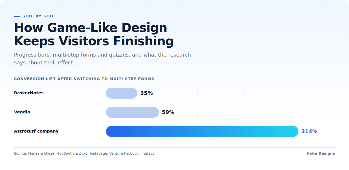
This infographic sums up the article on one page. Save it, share it with your team, or read on for the detail and the sources behind it.
In this article · 4 sections · 6 min
Most people have abandoned a long online form partway through, or closed a page because it was unclear how much more was being asked of them. Website designers have been paying close attention to that frustration. One response has been to borrow ideas from games: visible progress, small steps that each feel like an accomplishment, and a bit of play that makes the experience feel less like paperwork.
At Hoke Designs, we have been designing websites since 2007, and we have watched these patterns move from novelty to near-standard practice. This article covers three related trends that are shaping how modern sites keep visitors engaged: progress indicators, multi-step forms, and interactive quizzes. For each one, we look at how it is being used and why it has become so popular.
Trend 1: Progress Indicators That Show Visitors How Far They’ve Come
A progress indicator can be a bar that fills up, a row of numbered steps, or a short line such as “Step 2 of 4.” These elements now appear on checkout pages, booking flows, account setup screens, onboarding tours and online courses. Their job is simple. They tell visitors where they are, how much is left, and that the end is in sight.
Why they work
The appeal of progress indicators rests on well-studied behavioral psychology. Researchers building on the goal-gradient hypothesis, which holds that people try harder as they get closer to a goal, developed concepts called the “endowed progress effect” and the “illusionary progress effect” to explain how consumers behave in rewards and loyalty programs.
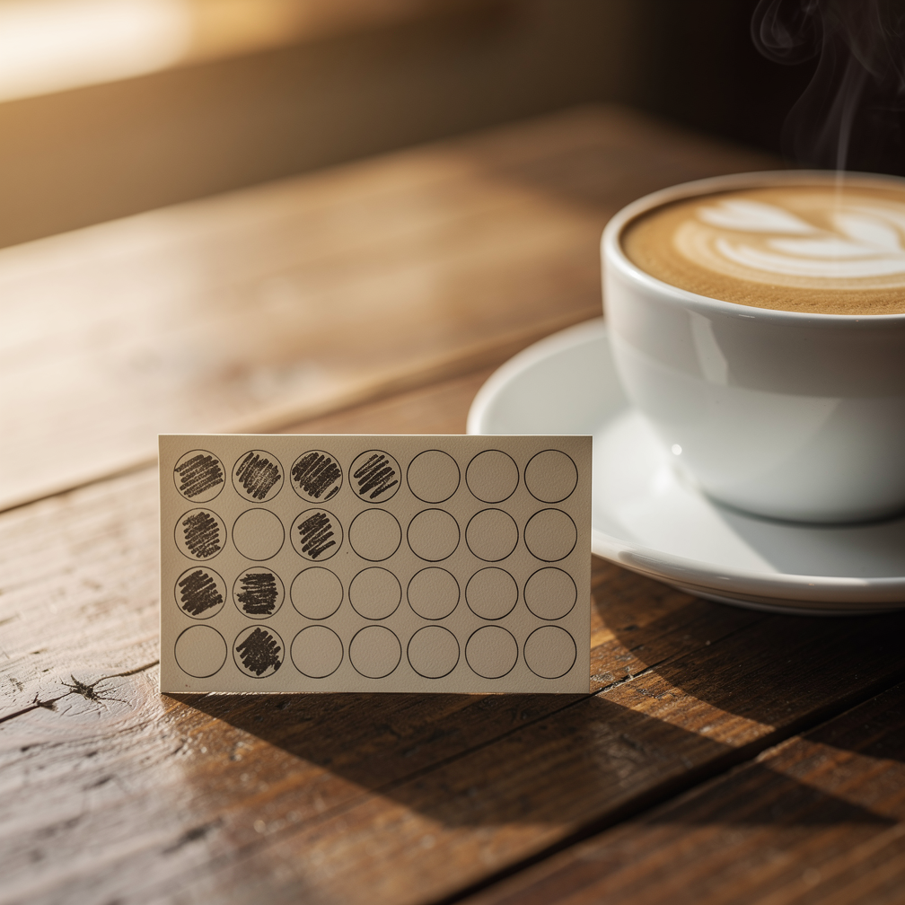
A well-known example comes from a loyalty-card study. In Nunes and Drèze’s 2006 research, customers given a 10-stamp card with 2 stamps already filled in completed it at a 34% higher rate than customers given an empty 8-stamp card, even though both groups needed exactly the same 8 purchases. That finding is the reason many designers now start progress bars slightly filled. When visitors feel they have already begun, they are more likely to finish.
Related research by Kivetz, Urminsky and Zheng found that the illusion of progress toward a reward goal makes people buy faster. Their experiments also showed that the effect was not explained by sunk cost. In other words, people were not simply trying to avoid wasting what they had already invested. The sense of momentum itself pushed them forward.
What the evidence says about websites
Progress bars are not a guaranteed fix, and the honest picture is more modest than some marketing claims suggest. A University of Gothenburg methodological note found that adding a progress bar to a web survey raised the completion rate by a reported 3.7, but had no effect on breakoff rate or survey duration. A progress indicator can help, but it will not rescue a process that is too long or confusing to begin with. It works best as one part of a well-structured experience.
Trend 2: Multi-Step Forms That Break Big Tasks into Small Wins
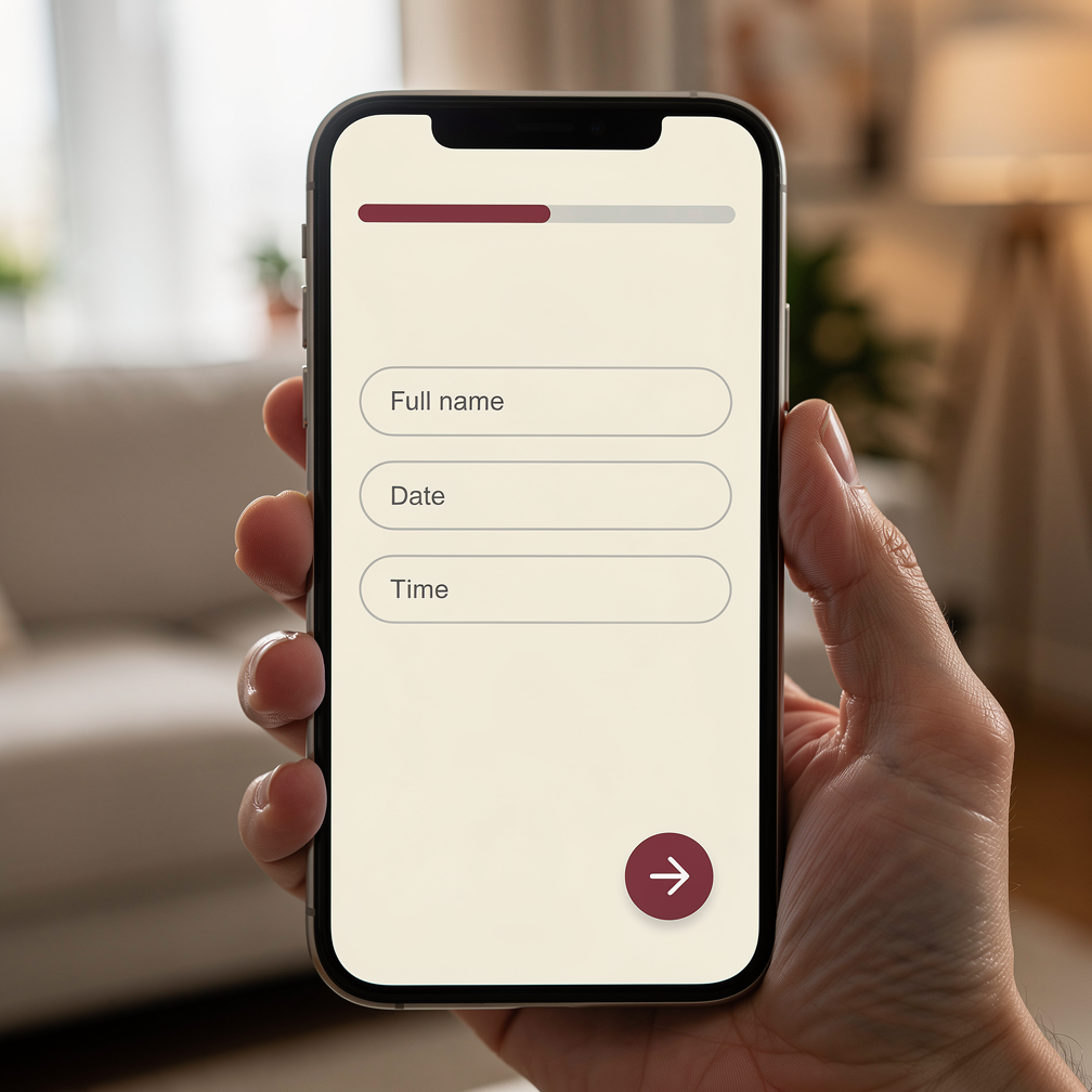
The second trend follows naturally from the first. Instead of presenting visitors with one long page of fields, many sites now split forms into short screens. The first step asks something easy, such as a name or the kind of service needed, and later steps gather the details. Each completed screen counts as a small win, and a progress indicator usually ties the steps together.
You see this pattern in quote requests, booking systems, appointment scheduling, registration pages and lead forms. For businesses that rely on inquiries, including tour operators, real estate offices and contractors, it has become one of the most practical design changes available.
Why multi-step forms are popular
The data behind multi-step forms is strong and fairly consistent. Zuko, a company that specializes in form analytics, says that comparative studies consistently find that breaking a complex or long form into multiple steps raises conversion rates, and notes that HubSpot reports 86% higher conversion rates for multi-step forms.
Controlled tests support that claim. In an Instapage A/B test with more than 25,500 visitors per variation, the multi-step form beat the alternative with an 18% higher conversion rate. Venture Harbour cites case studies in which switching to multi-step forms raised conversions by 35% for BrokerNotes, 59% for Vendio and 214% for an astroturf company.
The results hold up for smaller, local service businesses as well. In one UX case study for an AC repair company’s website, a redesigned multi-step form raised the form submission conversion rate from 7.62% to 13.13% over two weeks of A/B testing.
The reasons are easy to understand. A short first screen feels low-commitment. Grouping related questions makes each step easier to think through. Once visitors have answered a few questions, the momentum described in the loyalty-card research begins to work in the form’s favor.
Trend 3: Quizzes and Interactive Content That Make Engagement Feel Like Play
The third trend leans most directly into play. Interactive quizzes, calculators, product finders and “which option is right for you?” tools turn a passive page into something visitors actively take part in. Instead of reading about choices, visitors answer a few questions and get a personalized result.
Why interactive content holds attention
People tend to finish what they start, especially when it feels like a game. A compilation of interactive marketing statistics reports that 65% of people who start a quiz finish it, and that interactive content overall has a 72.7% completion rate across 3.8 billion views analyzed.

Quizzes also turn out to be effective at starting conversations. Interact, a quiz-building platform, reports that the average start-to-lead conversion rate across its quizzes has stayed around 40% since 2014. That consistency over many years suggests this is not a passing fad. It reflects something durable about how people like to engage online.
Quizzes also combine the first two trends. A good quiz is essentially a multi-step form with a progress indicator and a rewarding result at the end. Visitors enjoy it, and the business learns what those visitors are looking for.
Using Play Without Overdoing It
Gamified design works best when it serves visitors rather than manipulating them. A few principles keep it on the right side of that line:
- Be honest about length. A progress bar that stalls or jumps backward damages trust. Showing visitors a head start is reasonable, but the steps that follow should reflect the real work involved.
- Keep steps meaningful. Splitting a form into steps helps only if each screen groups related questions. Adding extra clicks for no reason defeats the purpose.
- Make the reward real. A quiz result, a confirmed booking or a finished lesson should give visitors something genuinely useful.
- Measure the results. As the Gothenburg findings show, effects vary. Analytics show whether a change is actually helping.
These patterns fit naturally with many of the features we build, including reservations and appointment booking, online courses, e-commerce checkouts and event registration. Because we design custom sites rather than templates, the flow can match how a particular business works. We also offer live feature demos for e-commerce, reservations, courses and events, so you can try these interactions yourself before deciding what suits your site.
If you’d like to talk about adding progress indicators, multi-step forms or interactive features to your website, call (424) 209-8199 or send a message through our contact form, and a person will reply within one business day.
Images are presented for illustration purposes only.We use real photographs when we need to show what was happening at a real event.
Keep reading
More on Web Design

Split-Screen Layouts and Bold Color Blocking in Web Design
Many modern homepages now cut the screen in half or into blocks of saturated color. We look at what split-screen layouts and color blocking are, how…

Scrollytelling Landing Pages and Horizontal Scroll Galleries: How These Web Design Trends Work
Scrollytelling turns a scroll into a guided story, and horizontal galleries let visitors swipe sideways through images and products. We look at how each trend works,…

Grain, Mesh Gradients and Hand-Drawn Illustration: The Tactile Turn in Web Design
Flat, clinical web design is giving way to sites with texture. We look at grainy textures, mesh gradients and hand-drawn illustration: how designers are using each…
Hoke Designs
Questions about your own website?
Talk to the team that writes these articles and looks after dozens of sites every day. You’ll get a straight answer.