
Sticky Navigation and Thumb-Zone Design: Where Menus Belong Now
Menus no longer have to sit in one row at the top of the page. We explain how sticky headers and thumb-zone design help visitors find their way, including a study that found people navigated 22% faster with a sticky menu, and the trade-offs of each approach.

At a glance
The short version
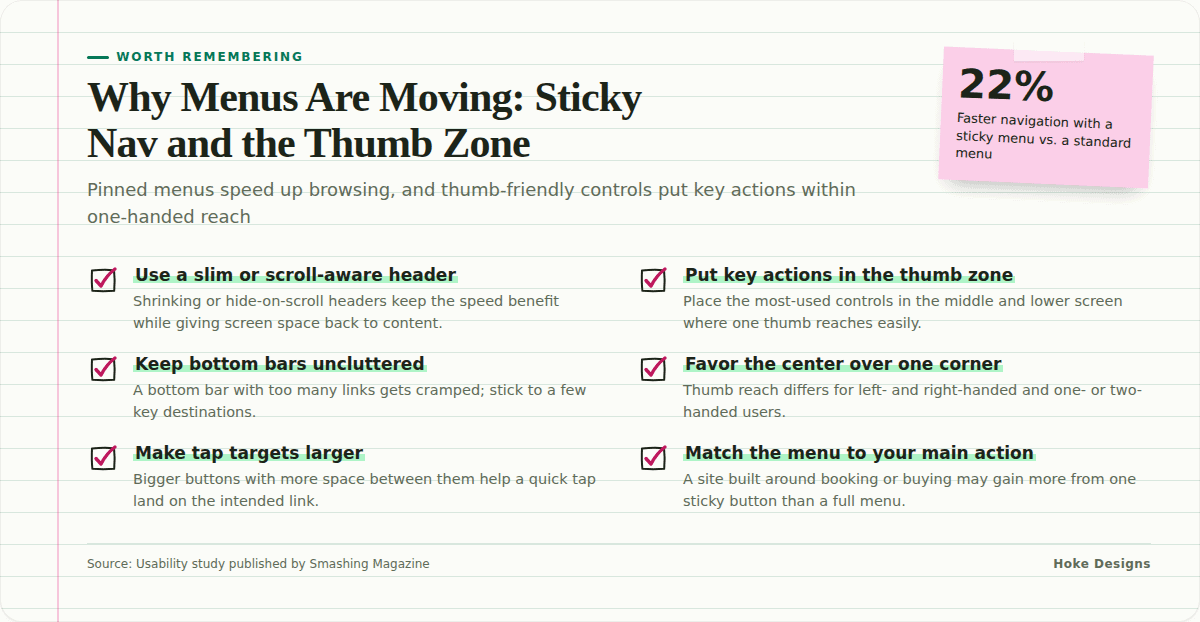
This infographic sums up the article on one page. Save it, share it with your team, or read on for the detail and the sources behind it.
In this article · 4 sections · 7 min
For most of the web’s history, the menu sat in one place: a row of links across the top of the page. You read down, and if you wanted to go somewhere else, you scrolled back up. That arrangement made sense when most people browsed on a desktop monitor with a mouse and a scroll wheel. It makes less sense now that many visitors arrive on a phone held in one hand, often while doing something else.
Two related trends are changing where menus live and how they behave. The first is sticky navigation, a menu that stays visible as you scroll. The second is mobile-first thumb-zone design, which places the most important controls where a thumb can reach them. Both start from the same question: where is the visitor’s attention and hand at this moment, and how can the menu be there too?
Trend One: Sticky Navigation
What it is
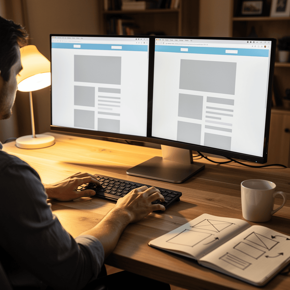
A sticky menu (also called a fixed or persistent header) stays pinned to the top of the browser window while the rest of the page scrolls beneath it. Whether a visitor is in the first paragraph of a long page or the last, the links to Home, Services, Contact, or Book Now are always one click away.
There are several common variations:
- Full sticky headers that keep the entire top bar, including the logo and every link, on screen at all times.
- Shrinking headers that start large and compress into a slimmer bar once the visitor begins scrolling, which saves screen space.
- Scroll-aware headers that hide when you scroll down to read and reappear the moment you scroll up, which is often a sign that you want to go somewhere else.
- Sticky calls to action, where only one button, such as “Call,” “Reserve,” or “Shop,” stays fixed instead of the whole menu.
Why it’s popular: the evidence
Sticky navigation isn’t only a matter of fashion. One of the best-known tests of the idea was a usability study published by Smashing Magazine. The author built two nearly identical test websites, where the only difference was that one used standard navigation and the other used sticky navigation. Because everything else was held constant, any difference in how people moved through the sites could be credited to the menu.
The results were clear. People navigated 22% faster with the sticky menu, because they didn’t have to scroll back to the top of the page to find what they were looking for. That might sound small, but it adds up. Based on the study’s data, sticky navigation could save about 36 seconds during a five-minute website visit. On the web, half a minute is long enough for a visitor to lose patience and leave.
The most striking finding may be the simplest one. Every participant in the study preferred the sticky menus, even though they couldn’t say why. People don’t usually notice good navigation. They notice when it’s missing. A menu that is always there removes a small bit of friction, and visitors feel the difference even when they can’t name it.
The trade-offs
Sticky navigation has costs. The same study noted that it can rule out some design choices a team may not want to give up, such as where a horizontal menu would most logically go. If a layout would naturally put the menu lower on the page, or beside a large hero photo, a pinned header may not fit.
There are practical concerns as well:
- Screen space. On a small phone, a tall fixed header can take up a large share of the visible area, leaving less room for content.
- Visual clutter. A header crowded with links, a phone number, social icons, and a search bar can feel heavy when it never goes away.
- Overlap issues. Poorly built sticky headers can cover anchor links, form fields, or the top line of text when a visitor jumps to a section.
This is why shrinking and scroll-aware headers have become so common. They aim to keep the speed benefit while giving more of the screen back to the content.
Trend Two: Mobile-First Thumb-Zone Design
What it is
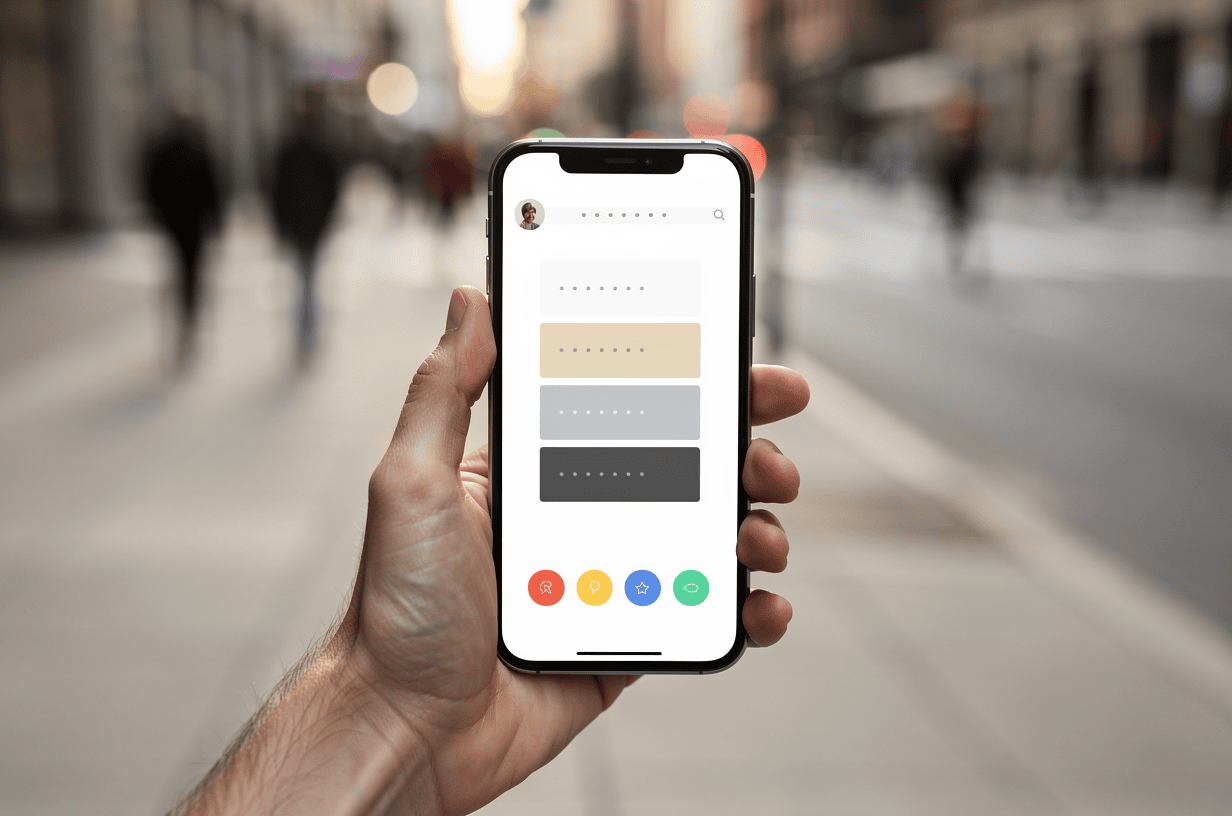
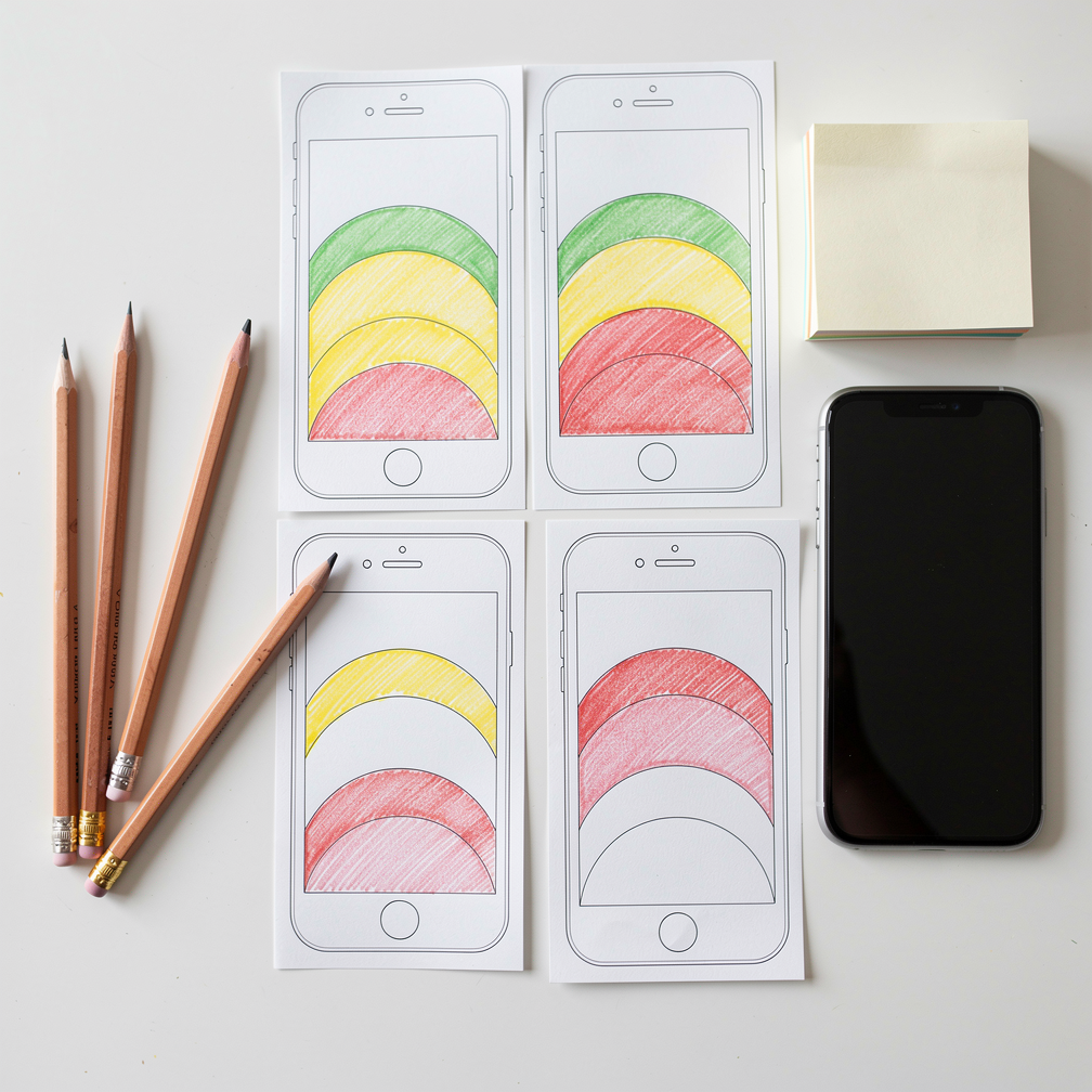
Think about how you hold your phone. For many people, it rests in one hand while the thumb does the tapping. The thumb reaches the middle and lower part of the screen easily. The top corners, especially the one opposite your thumb, take a stretch or a second hand.

Designers call the comfortable area the thumb zone. Thumb-zone design means placing the most-used controls inside that area and moving less critical items to the harder-to-reach edges. It is part of the broader mobile-first approach, where a site is planned for the small screen first and then expanded for tablets and desktops, instead of the other way around.
How it shows up on websites
Many people first saw thumb-zone thinking in apps, and it is now common on websites too:
- Bottom navigation bars that pin three to five key links to the bottom of the screen, just as many phone apps do.
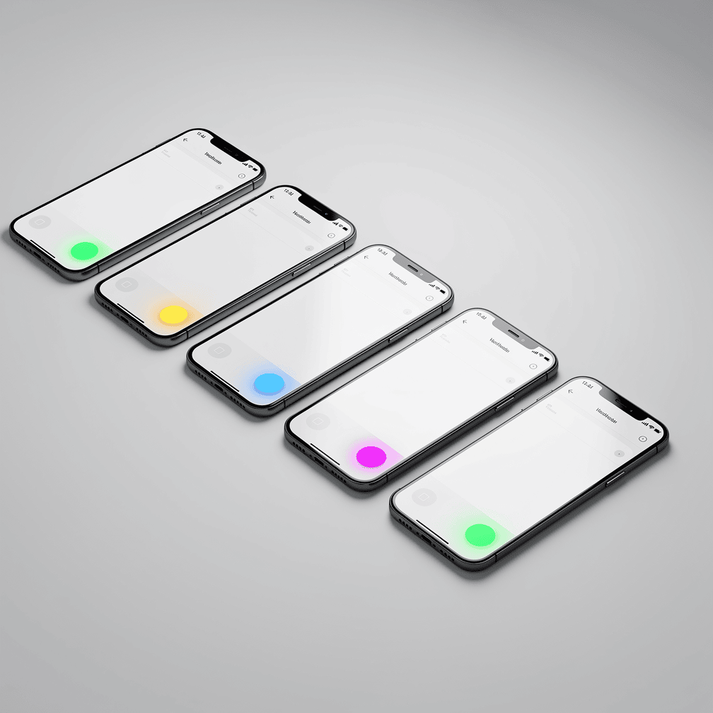
- Floating action buttons, usually a single round button in a lower corner for the most important task, such as calling or booking.
- Bottom-anchored menus that slide up from the bottom of the screen when the menu icon is tapped, so links appear near the thumb instead of at the top.
- Larger tap targets with more space between links, so a quick tap lands on the intended item and not the one next to it.
- Sticky bottom calls to action on product, booking, or listing pages, which keep “Add to Cart” or “Check Availability” within easy reach.
Why it’s popular
The appeal is comfort and speed. When the most important button sits where the thumb naturally rests, visitors can act without shifting their grip. This matters most when someone is on the move: checking a tour time while walking, looking up a business’s hours from a parking lot, or browsing listings during a lunch break.
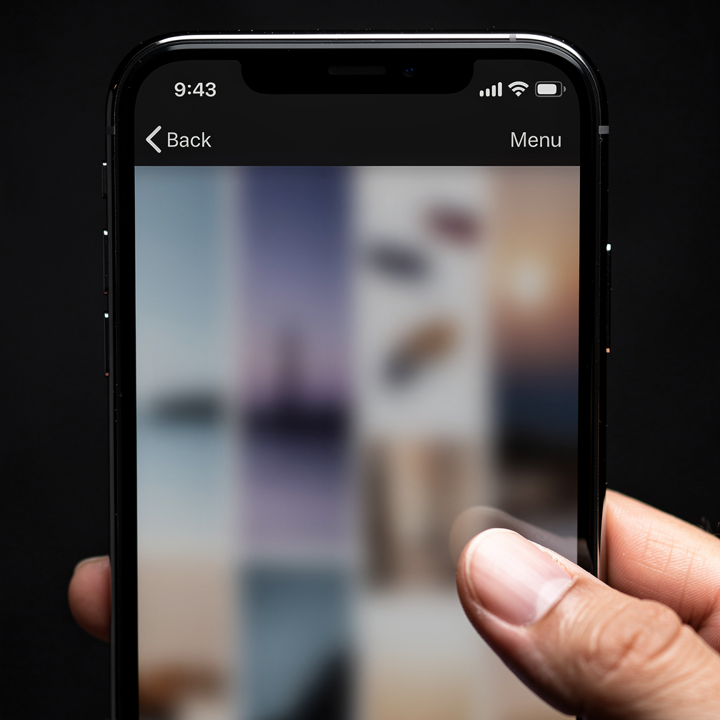
Thumb-zone design also borrows from habits people already have. Bottom navigation is familiar from the apps on nearly every phone, so a website that uses the same pattern feels intuitive. Visitors don’t have to learn anything new.
The trade-offs
Like sticky headers, bottom-anchored elements use screen space and can clash with the browser’s own controls, which often sit at the bottom of mobile screens. A bottom bar that tries to hold too many links becomes cramped. Thumb zones also differ between left- and right-handed users and between people who use one hand or two, so the best designs keep key actions near the center and avoid relying on a single corner.
Where the Two Trends Meet
Sticky navigation and thumb-zone design aren’t competitors. They solve the same problem from two directions. Sticky navigation keeps the menu visible in time, so it’s there no matter how far you’ve scrolled. Thumb-zone design keeps it reachable in space, so it’s where your hand already is. Many modern sites combine them: a slim sticky header with the logo and a menu icon at the top, and a sticky bottom button for the single most important action.
For businesses in Southeast Alaska, these choices aren’t abstract. A visitor planning a trip to Juneau, Sitka, or Ketchikan might compare tours, lodging, and charters on a phone. A homebuyer might scroll through property photos, and a contractor might pull up a service page on a job site. In each case, the question is the same: when this person is ready to act, is the button in front of them?
Choosing What’s Right for Your Site
Neither trend is a rule every site must follow. A short, simple site may not need a sticky header at all. A site built around one action, such as booking or buying, may get more value from a single sticky button than from a full persistent menu. A few questions can help you decide:
- How long are your pages, and how often do visitors need to jump elsewhere?
- What is the one action you most want a visitor to take?
- How much of your audience browses on phones?
- Does your layout leave room for a fixed element without crowding your content?
At Hoke Designs, we’ve been designing websites since 2007, and our sites are custom-designed rather than built from templates. That means navigation can be shaped around how your visitors actually browse, not fitted into a preset layout.
If you’d like to talk through what your menus should be doing, call (424) 209-8199 or send a message through our contact form, and a person will reply within one business day.
Images are presented for illustration purposes only.We use real photographs when we need to show what was happening at a real event.
Keep reading
More on Web Design
Variable Fonts and Custom Cursors: Small Web Design Trends
Variable fonts and expressive custom cursors are two small details that can make a website feel more polished and more like the brand behind it. We…
Kinetic Typography and Anti-Design: Web Design That Breaks the Rules
Moving headlines and deliberately rough layouts are replacing the clean, template-driven look. Here is what kinetic typography and anti-design brutalism are and how designers use them.…

AI Personalization and Conversational Interfaces: Web Design Trends for Southeast Alaska
Websites are shifting from static brochures to something closer to a helpful front desk. We look at AI-driven personalization, conversational interfaces and AI-readable sites, why they…
Hoke Designs
Questions about your own website?
Talk to the team that writes these articles and looks after dozens of sites every day. You’ll get a straight answer.