Kinetic Typography and Anti-Design: Web Design That Breaks the Rules
Moving headlines and deliberately rough layouts are replacing the clean, template-driven look. Here is what kinetic typography and anti-design brutalism are and how designers use them. We also cover how to keep a bold site usable and why a measured dose suits most businesses.
At a glance
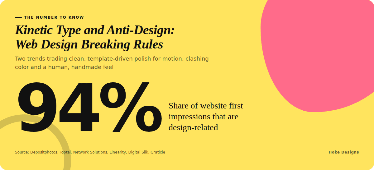
The short version
This infographic sums up the article on one page. Save it, share it with your team, or read on for the detail and the sources behind it.
In this article · 5 sections · 6 min
For years, the safest choice in web design was the cleanest one: lots of white space, tidy grids, a sans-serif font and nothing out of place. That polished look still has its place, but a growing number of websites are taking a different approach. They make headlines move, they clash colors on purpose, and they let layouts look a little rough around the edges.
Two trends lead this shift: kinetic typography and anti-design brutalism. Below, we look at what each one is, how designers are using it, and why it is resonating with audiences right now. We have been designing websites since 2007, and every site we build is custom rather than template-based, so trends like these are part of how we think about helping businesses stand out.
Why Breaking the Rules Is Catching On
Minimalism has had a long run. Toptal notes that minimalist web design has been the dominant approach for years, but brutalist design, with its rough clutter and raw functionality, is becoming more popular.
Part of the reason is fatigue. When many sites follow the same formula, they start to look interchangeable. Network Solutions reports that businesses are moving away from overly polished, template-driven designs as AI-generated layouts become more common. When software can produce a neat, generic homepage in seconds, a site that looks deliberately human gains an edge.
The stakes are real. Depositphotos cites the finding that first impressions of a website are 94% design-related. If visitors decide that quickly, a site that blends in may be forgotten just as fast.
Trend One: Kinetic Typography
What It Is
Kinetic typography is text in motion. According to Linearity, it uses motion to bring text to life and emphasize words, which makes it well suited to catching attention on websites, apps and social media. Depositphotos describes text that moves, rotates and transforms, and changes color, size and transparency.
How It Is Being Used
On real websites, kinetic typography shows up in a range of ways, from bold to subtle:
- Hero headlines that assemble letter by letter or slide into place when the page loads.
- Scroll-triggered text that grows, fades or shifts as a visitor moves down the page, guiding attention to key messages.
- Scrolling banners or tickers that cycle through services, locations or phrases.
- Hover effects where words stretch, change weight or shift color when a cursor passes over them.
Why It Is Popular
Motion draws the eye, and text is usually the most important content on a page. Kinetic typography combines the two, letting a brand control what visitors notice first. It is also gaining recognition as more than a novelty. Linearity’s 2025 font forecast listed it alongside retro revival, anti-design fonts, contemporary serif and variable fonts, calling kinetic typography a playful, memorable trend that is likely to last.
Agencies are seeing the same thing. An October 2025 press release from Digital Silk said kinetic typography is changing how brands communicate online through motion-driven text, citing Designmodo’s 2025 overview, which describes motion design and kinetic typography as becoming core to web experiences. Looking further ahead, Network Solutions includes kinetic typography among its top website design trends for 2026.
Trend Two: Anti-Design and Brutalism
What It Is
Brutalism and anti-design deliberately reject polish. Digital Silk describes brutalism in web design as flat design with stripped-down interface elements. Neo-brutalism goes further, using an anti-design style with flat background colors, unusual typography and elements some people consider “ugly.”
The wider anti-design movement covers a lot of ground. Network Solutions says it includes neo-brutalism, scrapbook-style collage, handwritten elements, uneven layouts, raw textures, overlapping graphics and asymmetrical compositions.
How It Is Being Used
In practice, anti-design can look like:
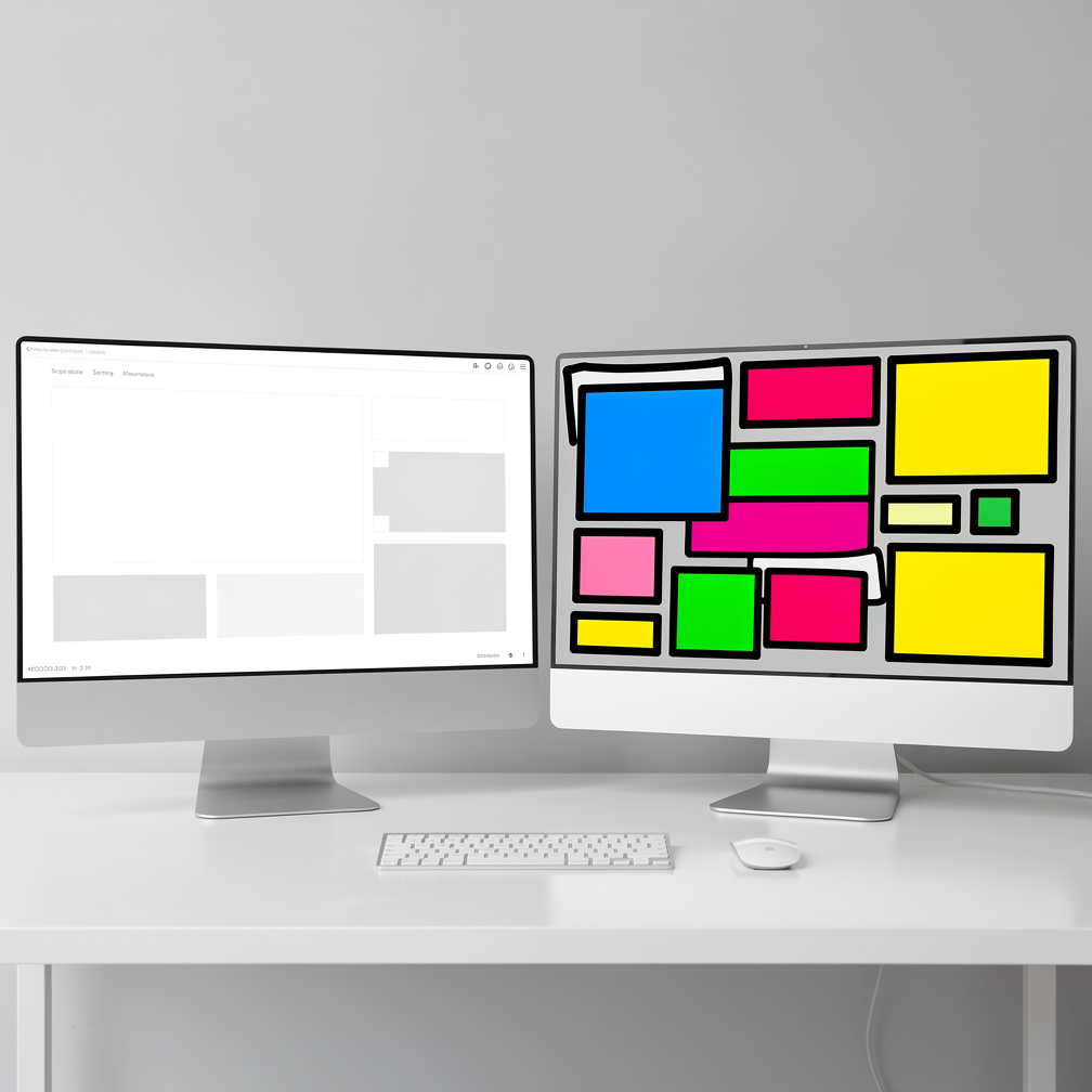
- Thick black outlines and blocky buttons set against flat, saturated background colors.
- Collage-style sections where photos, stickers, notes and text overlap.
- Off-grid layouts where columns don’t line up and images break out of their containers.
- Oversized or mismatched type used as a graphic element rather than just a way to deliver words.
- Handwritten touches such as scribbled arrows, underlines or annotations.
Why It Is Popular
The biggest draw is authenticity. Network Solutions says the appeal of anti-design comes from feeling authentic and human. In a sea of smooth, similar-looking sites, a layout that feels handmade signals that real people are behind it.
It is also worth clearing up a common misunderstanding. Graticle points out that anti-design does not mean ignoring usability or giving up on creativity. Instead, it questions what design should be. Good anti-design is still intentional; it just chooses different rules.
How to Break the Rules Without Breaking Your Website
Both trends carry risks if they are applied carelessly. Digital Silk warns that inconsistent typography can make a design look cluttered and unprofessional, and can cause accessibility problems for users with visual impairments. A few principles help keep bold design usable:
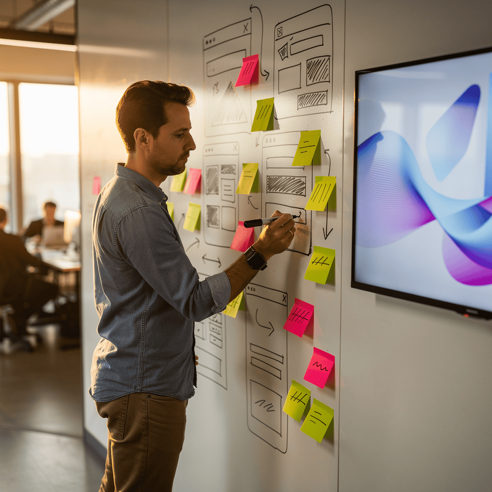
- Keep navigation predictable. Let the visuals be daring while menus, contact details and buttons stay easy to find.
- Use motion with purpose. Animate a headline or a key message, not every paragraph. Respecting device settings that reduce motion is good practice for visitors who are sensitive to animation.
- Protect readability. Body text should stay legible, with strong contrast and a sensible size, even if headlines get experimental.
- Test on phones. Overlapping graphics and moving text can behave very differently on a small screen.
- Match the brand. A raw, collage-style look may suit a creative or adventurous business but feel out of place for one that needs to project caution and precision.
Is Rule-Breaking Right for Your Business?
Not every site needs to shout. For many businesses, the best approach is a measured dose: a single animated headline on the homepage, a hand-drawn accent, or one section that steps off the grid. Small touches like these can make a site memorable without asking visitors to work harder to find what they came for.
For businesses across Southeast Alaska, from tour operators to contractors to research organizations, the question is the same one these trends are really asking: does your website feel like you, or like everyone else? Because we build custom sites rather than starting from templates, we can weigh where a bold idea helps and where a quieter approach serves your visitors better.
If you are curious whether kinetic type or a touch of anti-design could work for your site, call us at (424) 209-8199 or send a message via our contact form, and a person will reply within one business day.
Images are presented for illustration purposes only.We use real photographs when we need to show what was happening at a real event.
Keep reading
More on Web Design
Variable Fonts and Custom Cursors: Small Web Design Trends
Variable fonts and expressive custom cursors are two small details that can make a website feel more polished and more like the brand behind it. We…
Sticky Navigation and Thumb-Zone Design: Where Menus Belong Now
Menus no longer have to sit in one row at the top of the page. We explain how sticky headers and thumb-zone design help visitors find…
AI Personalization and Conversational Interfaces: Web Design Trends for Southeast Alaska
Websites are shifting from static brochures to something closer to a helpful front desk. We look at AI-driven personalization, conversational interfaces and AI-readable sites, why they…
Hoke Designs
Questions about your own website?
Talk to the team that writes these articles and looks after dozens of sites every day. You’ll get a straight answer.