IDENTITY · OUR OWN STUDIO · 2013–2019
Hoke Designs
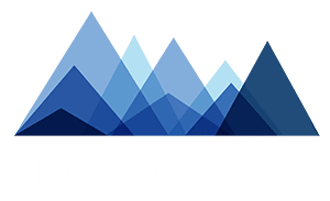
Our own mark has been redrawn three times. The current lockup, drawn in 2018, stacks nine translucent triangles into a Southeast Alaska skyline above a squared-off geometric wordmark, and its mountains grew into the illustration across the top of our 2019 home page.
01 · The mark
Measured and spaced
2013. A bold wordmark knocked out of a blue bar.
Before 2018. A circular H monogram in an ornamental frame, set in ITC Avant Garde, Conthrax and Sketchtica.
2018 to today. The mountain lockup. Each triangle is one flat color multiplied over its neighbors, so the overlaps make the in-between blues. On the web we ship it as outlined SVG paths, so it stays sharp and needs no web font.
Typefaces The Shape Of Things (wordmark) · Avenir (tagline)
02 · Color
Navy, Harbor Blue, Sky, Ice
Click a chip to copy its hex
03 · In the world
Out in the world
Next · P-03 · Editorial
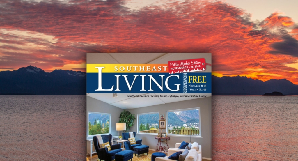
Southeast Living Magazine →