Web Motion Trends: Scroll-Driven Animation, Micro-Interactions and Reduced Motion
Motion now shapes how websites feel to use. We look at three connected trends: scroll-driven animation, micro-interactions, and motion that respects user preferences. For each, we cover how it works, why it has caught on, and how designers are using it with purpose.
At a glance
The short version
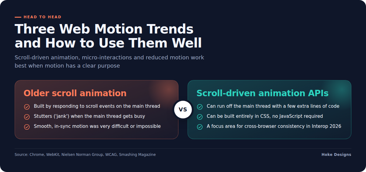
This infographic sums up the article on one page. Save it, share it with your team, or read on for the detail and the sources behind it.
In this article · 4 sections · 7 min
Think about the last website that felt good to use. It probably wasn’t just the colors or the photos. Things likely moved when you did. A headline slid into place as you scrolled, a button responded when you tapped it, or a progress bar filled as you worked through a form. Motion has become one of the defining features of modern web design, and the tools behind it have improved a great deal in the last few years.
This article covers three connected trends: scroll-driven animation, micro-interactions, and motion that respects user preferences. For each one, we look at how it’s being used and why it has caught on.
Trend 1: Scroll-Driven Animation
What it is
Most animations on the web run on a clock. They start, play for a set number of seconds, and stop. Scroll-driven animations are tied to the reader’s scrolling instead. Scroll down and the animation moves forward. Scroll back up and it runs in reverse. The reader controls the pace.
This became much easier to build when the CSS animation-timeline property was added to the CSS Animations Level 2 specification in June 2023. The property lets animations be driven by something other than elapsed time, such as a user scrolling up and down the page.
Why it’s suddenly everywhere
Scroll effects aren’t new. Designers have wanted them for years. The difference is that they used to be hard to build and often didn’t run smoothly. According to a Chrome performance case study, the only way to build scroll-driven animations used to be responding to the scroll event on the main thread, the same part of the browser that handles nearly everything else on the page. When that thread gets busy, animations stutter, which developers call “jank.” As a result, smooth animation that stayed in sync with scrolling was very difficult or impossible.
The new approach solves much of that. Chrome’s documentation explains that the scroll-driven animation APIs build on the existing Web Animations API and CSS Animations, so these animations can run off the main thread with only a few extra lines of code. In practical terms, the motion stays smooth even while the rest of the page is doing work.
Browser support is also coming together. Apple added support for scroll-driven animations in Safari 26.0, and WebKit notes that these animations can now be built entirely in CSS, with no JavaScript required for the animation to move forward as the user scrolls. On top of that, scroll-driven animations are one of the Interop 2026 focus areas, a joint effort to make browsers behave consistently. That focus area covers the animation-timeline, scroll-timeline and view-timeline CSS properties. When browser makers commit to consistency like this, designers can use a feature more confidently.
How it’s being used
Scroll-driven animation works best when it helps tell a story or guides the eye. Common uses include:
- Reading progress indicators that fill across the top of a long article as you read.
- Reveal effects, where images and text fade or slide in as they come into view.
- Parallax-style layering, where background and foreground elements move at different speeds to add depth.
- Step-by-step storytelling, where a process or timeline unfolds one stage at a time as the reader scrolls.
For a business in Southeast Alaska, you can picture how this might work: a tour operator’s page where a route map draws itself as visitors scroll through the itinerary, or a construction company’s project page where before-and-after images shift as the reader moves down. Used with restraint, this kind of motion keeps people engaged without getting in the way of the information they came for.
Trend 2: Micro-Interactions
What they are
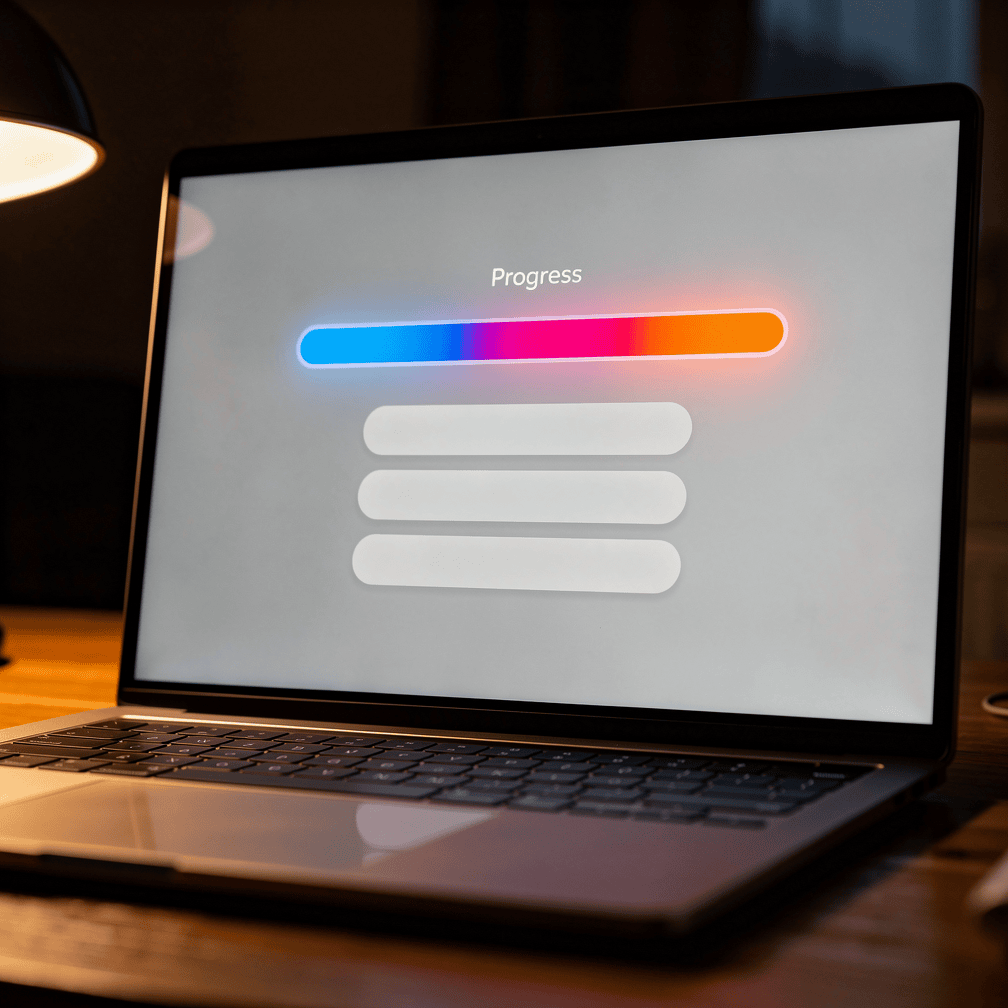
If scroll-driven animation is the big picture, micro-interactions are the small details. They’re small moments that link a user’s action to the system’s response, like a button that ripples when clicked or a bar that fills as a task progresses.
Other familiar examples include a heart icon that pops when you “like” something, a form field that turns green when you’ve entered a valid email address, a menu icon that changes into an “X” when it opens, or a gentle shake when a password is wrong.
Why they matter
Micro-interactions are popular because they answer a question users are always quietly asking: Did that work? Without feedback, people click twice, wonder whether a form went through, or leave a page thinking something broke.

This ties back to one of the core principles of usability. The Nielsen Norman Group names visibility of system status as one of the most often violated usability heuristics. Put simply, websites often fail to show people what’s happening. A well-placed micro-interaction fixes that in a fraction of a second.
How they’re being used
The best micro-interactions are easy to overlook, which is the point. They show up in places like:
- Booking and reservation forms, where a confirmation animation reassures the customer that their request went through.
- E-commerce carts, where the cart icon briefly bounces or updates its count when an item is added.
- Loading states, where a subtle animation shows that content is on its way instead of leaving a blank screen.
- Navigation, where hover and tap effects make it clear what can be clicked.
For businesses selling products, taking reservations or registering people for events online, these small signals can build trust. A customer who feels confident that the site is working is more likely to finish what they started.
Trend 3: Motion That Respects the User
Not everyone wants movement
As motion has become more common, so has awareness that it doesn’t work for everyone. For some people, animation causes real problems. People with vestibular (inner ear) disorders need control over movement triggered by interactions, because that movement can cause distraction, dizziness and headaches.
The Web Content Accessibility Guidelines address this directly. WCAG 2.3.3, Animation from Interactions (Level AAA), covers animations triggered by actions like scrolling or clicking, which can cause real discomfort. The guidance is to reduce or remove animations automatically when users have set a “prefers-reduced-motion” preference in their device settings. Another option WCAG points to is a site-wide control to turn off non-essential animations.
How designers are building it in
The trend is toward treating reduced motion as part of the design from the start rather than a fix added later. The prefers-reduced-motion media query can help meet WCAG 2.3.3, and Chrome DevTools can simulate the preference so designers can test both versions of a page. The same source notes one limit: the media query doesn’t cover autoplaying or looping content, which still needs explicit pause controls under WCAG 2.2.2.
For scroll-driven effects in particular, Smashing Magazine recommends combining reduced-motion media queries with the @supports rule. That way, animations only run when the user hasn’t asked for less motion and the browser supports the feature. Everyone else still gets a clean, fully working page without the movement. This approach is called progressive enhancement: the core experience works for everyone, and the extras appear only where they’re welcome and supported.
Why These Trends Work Together
These three trends are really parts of one idea. Scroll-driven animation makes pages feel responsive to the reader. Micro-interactions make individual actions feel acknowledged. Respecting motion preferences makes sure all of that helps people instead of pushing some of them away.
The common thread is purpose. Motion that guides attention, confirms an action or tells a story earns its place. Motion added only because it’s possible tends to feel like clutter, slows people down, and can make some visitors physically uncomfortable.
Hoke Designs has been designing websites since 2007, and our sites are custom-designed rather than built from templates. That kind of work means decisions like these, such as where motion helps and where it doesn’t, can be made for each business and its audience, whether that’s a visitor planning a trip through Glacier Bay or a homebuyer browsing listings in the Mendenhall Valley.
If you’d like to talk about bringing thoughtful motion to your website, call (424) 209-8199 or send a message through our contact form, and a person will reply within one business day.
Images are presented for illustration purposes only.We use real photographs when we need to show what was happening at a real event.
Keep reading
More on Web Design
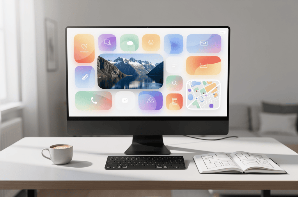
Bento Grids and Oversized Typography: Two Web Design Trends Worth Knowing
Modular tile layouts and huge headlines are showing up on product pages, portfolios and brand sites. We explain what bento grids and oversized typography are, where…
The Importance of a Professional Website for Your Business
In today's digital age, having a professional website for your business is essential. A website is often the first point of contact between your business and…
Six Security Gaps in DIY Website Hosting and How to Close Them
Self-hosted sites rarely fail from dramatic hacks. Instead, routine work stops happening: plugin updates, server patches, login cleanup, certificate renewals and offsite backups. We walk through…
Hoke Designs
Questions about your own website?
Talk to the team that writes these articles and looks after dozens of sites every day. You’ll get a straight answer.