Bento Grids and Oversized Typography: Two Web Design Trends Worth Knowing
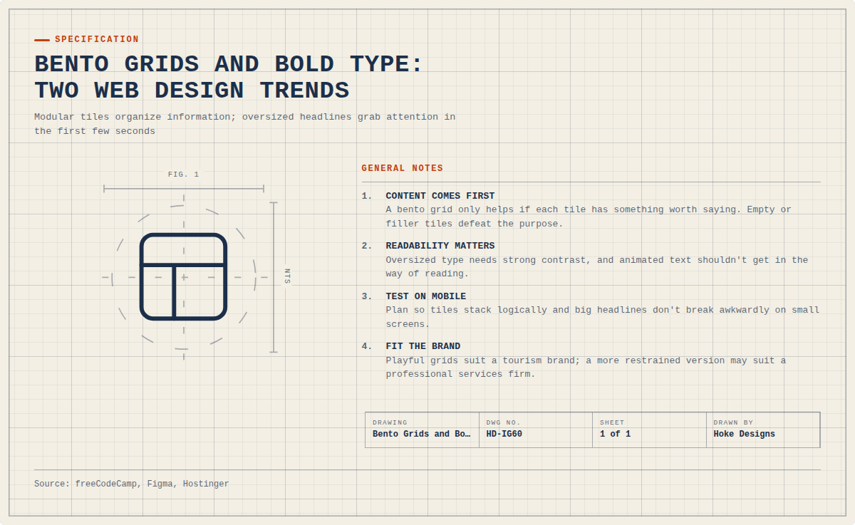
Modular tile layouts and huge headlines are showing up on product pages, portfolios and brand sites. We explain what bento grids and oversized typography are, where they came from, why they work, and how to use them without losing clarity.
At a glance
The short version
This infographic sums up the article on one page. Save it, share it with your team, or read on for the detail and the sources behind it.
In this article · 4 sections · 7 min
If you’ve browsed a product launch page, a design portfolio, or a new brand site lately, you’ve probably seen two things. The page is split into neat tiles of different sizes, and the headline is so large it nearly fills the screen. These are two of the most noticeable web design trends right now: bento grids and oversized typography.
At Hoke Designs, we’ve been designing websites in Juneau since 2007, and we’ve seen plenty of trends come and go. Some trends are only fashion. These two last longer because they solve real problems: how to organize a lot of information, and how to get a visitor’s attention in the first few seconds. Below, we explain what each trend is, how designers are using it, and why it has caught on.
Trend 1: Bento Grids
What a bento grid is
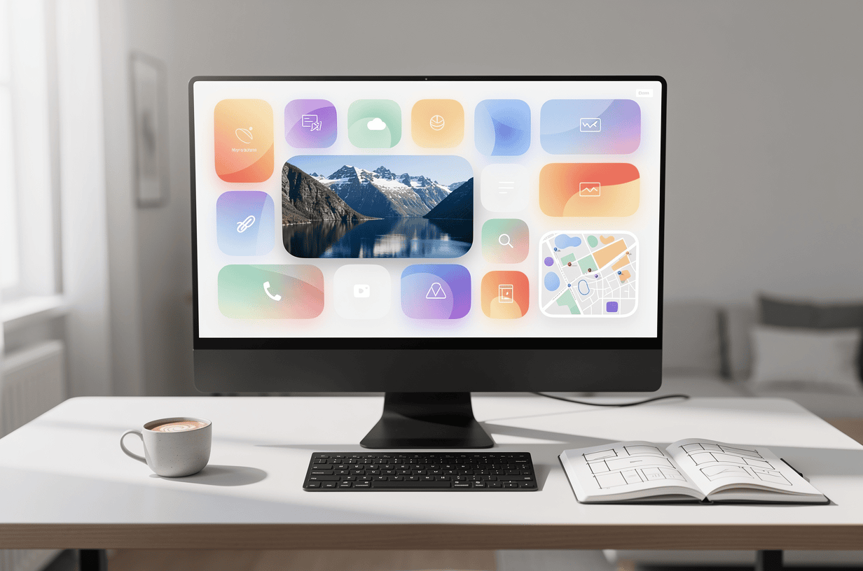
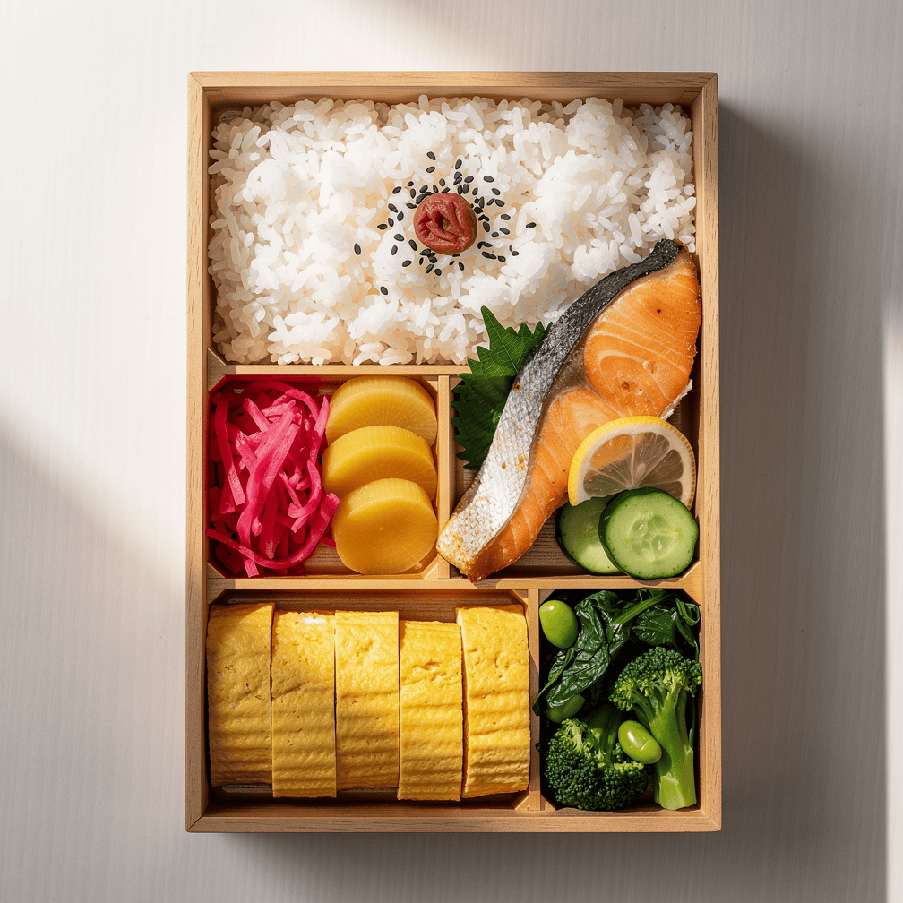
A bento grid splits a webpage into a set of modular tiles or cards, and each tile is sized by how important its content is. The name comes from the Japanese bento lunch box, which keeps each part of a meal in its own compartment. On a website, the “compartments” might hold a photo, a short stat, a testimonial, a map, or a call to action. The most important item gets the biggest box.
Where it came from
Bento grids appeared as a modern UI/UX approach in the early 2020s. Apple’s product keynotes gave the style a big boost, and that exposure helped make asymmetrical, modular layouts an accepted alternative to rigid grid systems. Apple now uses bento grids in its keynotes, websites, product pages and manuals, and competitors such as Google have picked up the layout too.
Not everyone credits Apple with the idea, though. Some designers argue that the bento style really started with Microsoft’s Metro design language, introduced with Windows Phone 7. If you remember the colorful “live tiles” on those phones, the family resemblance is easy to see.
How designers build them
A bento grid can look loose and playful, but there is a lot of order underneath. These layouts are usually built on a set grid, such as 3×3 or 4×4. Designers keep them interesting by varying the block sizes while still following that underlying structure. One tile might span two columns, another might run two rows tall, and a few small squares fill the gaps. That hidden grid keeps the design tidy when it adapts to phones and tablets. On a narrow screen, the tiles can stack in a sensible order without falling apart.

Why bento grids are popular
The appeal goes beyond good looks. According to freeCodeCamp, compartmentalized bento grids give users a predictable rhythm to follow, which reduces cognitive load and improves the overall user experience. Visitors don’t have to hunt for information. Each idea sits in its own clearly defined space, and the size of each space tells them what matters most.
That is why the trend isn’t just for tech companies. Bento grids are a practical fix for a common problem on small business websites: too much information and not enough clarity. Many small businesses need to show their services, hours, location, reviews and photos all at once. A bento layout gives each of those a home.
Think about how this could work for businesses here in Southeast Alaska. A tour or charter operator could use a large tile for a striking photo or video, with smaller tiles for trip lengths, departure ports, and a booking button. A real estate office could feature one standout listing in a wide tile and surround it with neighborhood highlights and contact details. A construction or survey firm could pair aerial imagery with quick project facts. In each case, the layout turns a crowded page into something visitors can scan at a glance.
Trend 2: Oversized, Bold Typography
What’s happening with type
The second trend is all about letters, and big ones. Figma lists bold typography as one of its top web design trends for 2026, noting that brands are using custom fonts, oversized headlines, motion and layered styles to make a strong first impression. Figma names Glossier and Samsung as standout examples. Hostinger also calls bold, experimental typography a top trend, saying designers are using oversized type, bold fonts and even retro type to stand out.
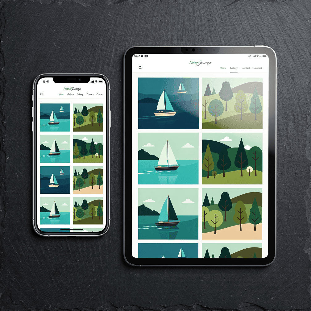
How it’s being used
The top of the homepage, often called the hero section, is where this trend shows up most. Figma says hero sections now often use kinetic lettering, dynamic font pairings and variable fonts that respond to interaction or context. In practice, a headline might shift weight as you scroll, animate into place when the page loads, or pair a heavy display font with a clean, simple body font for contrast.
Oversized type isn’t right for every part of a site. Bold, expressive fonts work especially well in hero sections, on landing pages, on marketing websites, and for personal brands and portfolios. Those are the places where a single message needs to land quickly. Deeper pages, such as service details, policies, or long articles, usually still call for comfortable, readable body text.
Why bold type is popular
Visitors decide very quickly whether a site is worth their time. A huge, confident headline states the main message before anyone scrolls. It also carries a brand’s personality in a way that stock photos often can’t. A rugged, heavy typeface says something different from a delicate serif, and both say more than a generic default font.
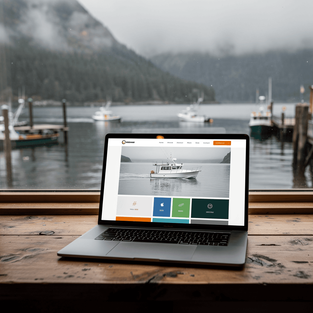
Bold type also works well on phones. A short, large headline stays readable on a small screen, while a long paragraph squeezed into a hero image does not. Oversized type pushes designers and business owners to trim their message to its core, which usually makes it stronger.
Why These Two Trends Work So Well Together
Bento grids and oversized typography complement each other. The grid provides structure, and the type provides emphasis. A common pattern is one large tile holding a bold headline, with smaller tiles around it for supporting details. The big words grab attention, and the tidy compartments guide the visitor to what comes next.
Both trends share the same idea: visual hierarchy. Size tells people what matters. A bigger tile or a bigger word signals priority, so visitors understand the page before they read every line.

Using Trends Thoughtfully
Trends are tools, not rules. A few things to keep in mind:
- Content comes first. A bento grid only helps if each tile has something worth saying. Empty or filler tiles defeat the purpose.
- Readability matters. Oversized type should still have strong contrast against its background, and animated text shouldn’t get in the way of reading.
- Test on mobile. Both trends need careful planning so tiles stack logically and big headlines don’t break awkwardly on small screens.
- Fit the brand. A playful grid and experimental fonts may suit a tourism brand, while a more restrained version may suit a professional services firm.
Because we build custom-designed sites rather than templates, the goal is always to fit a trend to the business, not the other way around. For many organizations, a modular layout and a confident headline can make a site clearer, more memorable, and easier to use.
If you’re curious how these ideas might work for your own site, call us at (424) 209-8199 or send a message via our contact form, and a person will reply within one business day.
Images are presented for illustration purposes only.We use real photographs when we need to show what was happening at a real event.
Keep reading
More on Web Design
Web Motion Trends: Scroll-Driven Animation, Micro-Interactions and Reduced Motion
Motion now shapes how websites feel to use. We look at three connected trends: scroll-driven animation, micro-interactions, and motion that respects user preferences. For each, we…
The Importance of a Professional Website for Your Business
In today's digital age, having a professional website for your business is essential. A website is often the first point of contact between your business and…
Six Security Gaps in DIY Website Hosting and How to Close Them
Self-hosted sites rarely fail from dramatic hacks. Instead, routine work stops happening: plugin updates, server patches, login cleanup, certificate renewals and offsite backups. We walk through…
Hoke Designs
Questions about your own website?
Talk to the team that writes these articles and looks after dozens of sites every day. You’ll get a straight answer.